Vintage Soft Drink Ads and the Art of Selling Summer
The best vintage soft drink ads did not behave like product ads at all. They looked like invitations: to sit in the right booth, wear the right clothes, be seen with the right people, and feel instantly more at home in the American summer. Between the 1950s and 1970s, soda brands learned that refreshment was only part of the pitch. The bigger reward was social. A bottle of cola or lemon-lime fizz became a shortcut to coolness, youth, and belonging.
That is what made the era so visually rich. These ads were built from color, chrome, sunlight, and atmosphere. They used diners, drive-ins, pools, picnics, and parties to make a drink feel less like a grocery purchase and more like a lifestyle signal.
Why vintage soft drink ads sold a feeling, not just a flavor
Soft drinks have always had a built-in advantage: they are easy to picture in a social setting. A cold bottle on a table means company. A fizzing glass on a summer afternoon means escape. Mid-century advertisers understood that if they could attach soda to the best parts of modern life, they could sell far more than sweetness and carbonation.
The trick was emotional compression. In a single image, the ad had to deliver:
- a sense of heat relieved by cold
- a suggestion of youth and energy
- a setting that felt aspirational but attainable
- a social scene where the drink belonged naturally
That’s why the most memorable campaigns rarely showed an isolated bottle on a plain background. They staged a little world around it. The drink was never alone for long.
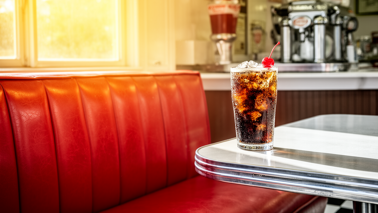
The chrome diner as a stage set for modern life
The 1950s gave soda advertising one of its most durable visual backdrops: the chrome diner. Polished counters, neon glow, checkered floors, and milkshake-like glassware created a space where modernity looked casual and fun rather than intimidating.
In these ads, the diner did more than suggest a place to drink soda. It suggested a code of behavior. You were not at home, not at work, not in the old world of rationing or restraint. You were out in public, participating in a more stylish version of daily life. The bottle or fountain glass sat inside that fantasy as the finishing touch.
What made the diner setting so effective:
1. It was public but intimate
A diner is a shared space, but the booth still feels personal. That balance let advertisers imply both sociability and individuality.
2. It looked modern
Chrome and glass made everything feel cleaner, faster, and more future-facing. Soda fit that aesthetic perfectly.
3. It made the product feel universal
Unlike a luxury restaurant, the diner was accessible. The message was clear: this kind of coolness was within reach.
The visual language was simple, but the effect was powerful. Put the drink on a shining counter, add a few well-groomed people, and the soda becomes part of a broader American dream.
Color was doing half the selling
One reason vintage soft drink ads still pop on a page or screen is that they were designed to exploit contrast. Cold drinks looked colder against warm summer skies. Red, blue, yellow, and green packaging jumped off white tablecloths, picnic blankets, and outdoor scenes. Ice cubes sparkled. Condensation mattered. So did the glass itself.
Advertisers knew that color could create taste before the first sip. Bright citrus hues implied tartness and sparkle. Deep cola tones suggested depth and familiarity. Clear fizzy liquids signaled freshness and lightness. Even when the ad used a very limited palette, it was often a strategic one: just enough visual noise to suggest energy, but not so much that the product got lost.
The result was a kind of visual thirst. The page made you feel the temperature. And once the image had done that work, the drink became almost secondary.
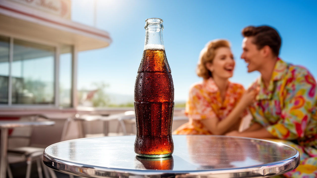
Summer scenes turned soda into social currency
If the diner gave soda a modern indoor home, summer scenes gave it its emotional peak. Beaches, backyards, porches, road trips, and picnics all turned up repeatedly in beverage advertising because they framed the drink as something you shared when life was lightest.
A cold soda at a picnic does not merely quench thirst. It suggests that the day is going well. It implies enough leisure to pause, enough company to pour another glass, enough sun to make coldness feel like a small victory.
These ads often leaned on a simple formula:
- attractive people in motion
- a bright outdoor setting
- a cold drink arriving at the exact right moment
- a mood of relaxed social success
That formula was effective because it shifted the product’s role. Soda was no longer the main event. It was the proof that the main event was already happening.
Celebrities and the borrowed glow of fame
By the 1960s, celebrity endorsement had become one of the easiest ways to lend a soft drink some borrowed prestige. A familiar face could do in a single frame what a paragraph of copy could not: transfer status.
This worked especially well in soft drink advertising because celebrity appeal matched the category’s emotional promise. If a star looked refreshed, glamorous, or casually delighted by a drink, consumers could imagine that same energy entering their own lives. The soda became part of the star’s aura.
The logic was subtle but effective:
- famous people already seem worth watching
- people worth watching seem worth imitating
- if they choose this drink, the drink must belong to their world
The smartest campaigns did not rely on celebrity alone. They paired fame with a scene that looked approachable. A star in a sleek lounge, on a sunny patio, or at a party still felt like a person you could picture beside you. That mix of distance and familiarity was the sweet spot.
Party imagery made fizz feel social, youthful, and a little aspirational
Nothing sold soft drinks quite like a party. Cocktail hours, backyard barbecues, teen dances, and informal gatherings all gave advertisers a ready-made answer to the question, “Who is this for?” The answer was: people who know how to have a good time.
Party imagery did three jobs at once. It made the drink look:
- Social — because it belonged in a crowd
- Youthful — because the atmosphere felt active and current
- Aspiring — because the guests looked polished, attractive, and in the know
This is where the ads became especially revealing. They were not just celebrating fun; they were sorting people. The right soda was a marker of taste, confidence, and belonging. You did not simply buy the beverage. You joined the mood.
And because the ads often avoided overt hard sell language, the aspiration felt smoother. No one was being lectured. They were being shown a desirable scene and invited to step into it.
How packaging and copy worked together
The visuals carried the mood, but the copy sealed the promise. Mid-century beverage ads loved words like “cool,” “sparkling,” “refreshing,” and “brisk,” because those terms linked physical sensation to social identity.
The language usually worked in one of three ways:
Sensory language
Words that described temperature, bubbles, and taste made the product feel immediate.
Lifestyle language
Words about fun, style, and togetherness made the drink feel culturally relevant.
Convenience language
Phrases about easy serving or ready refreshment made soda seem like a natural part of modern living.
Good copy did not overpower the image. It reinforced it. If the picture showed a beach party, the text suggested what that party meant. If the picture showed a diner booth, the text told you why that booth mattered. The whole ad became a compact fantasy with very little wasted space.
The 1970s: brighter colors, looser vibes, and more casual cool
By the 1970s, the visual language of soda advertising had shifted. The polished, idealized world of the 1950s gave way to a looser, more casual style. The people in the ads looked less formal. The colors grew bolder. The settings felt more relaxed, sometimes more playful, sometimes more overtly youthful.
That change matters because it shows how soft drink brands kept chasing the same goal with a new look. The promise was still coolness and social belonging, but the costume changed.
Where the 1950s sold order and polish, the 1970s leaned into ease and spontaneity. The soda was still the social signal. It just arrived in a more laid-back register.
Why these ads still work on us now
Part of the appeal of vintage soft drink ads is obvious: they are visually satisfying. The color palettes are clean. The settings are rich. The cultural shorthand is instantly legible. But the deeper reason they still work is that they expose a marketing truth that never really went away.
People rarely buy beverages for hydration alone. They buy them for the moment they imagine around the drink.
That is why these campaigns remain so useful to study today. They show how advertising can turn a basic commodity into a symbol. They show how a product can become a cue for youth, social life, and taste. And they show how quickly a simple beverage can be transformed into a miniature version of the good life.
What modern marketers can learn from soda’s golden age
There is a reason retro soda campaigns still feel fresh to creative teams. They are built on clean, repeatable principles that still apply.
A few lessons stand out:
- Sell the scene, not just the item. Context gives the product meaning.
- Use color with purpose. Strong visual contrast can imply temperature, mood, and taste.
- Show social proof without forcing it. People want to imagine themselves inside the moment.
- Keep aspiration close to reach. The dream lands better when it feels possible.
- Let the product belong to the lifestyle. Don’t isolate it from human behavior.
Those ideas explain why soda ads from the mid-century era remain such a durable reference point. They were simple, but not simplistic. They knew that a drink can be a drink and a signal at the same time.
For a broader look at why this kind of persuasion still resonates, see Why Retro Ads Still Work: Mascots, Muscle, Memory and Retro Ads as Creative Fuel for Modern Teams. If you’re interested in how similar emotional cues were used in another category, 1950s Cereal Ads and the Parenting Pitch Behind Breakfast is a useful comparison.
The lasting fizz of mid-century aspiration
The best vintage soft drink ads captured something more durable than a beverage trend. They bottled a social fantasy: that with the right drink in hand, a summer afternoon could feel smoother, brighter, and just a little more glamorous.
That is why the chrome diners, poolside scenes, celebrity cameos, and party tables still hold up. They were not decoration. They were the argument.
The soda was cold, yes. But the real product was belonging.
If you have a favorite vintage soda ad—or a campaign you think nailed the cool factor—share it in the comments. I’d love to hear which examples still fizz for you.