
Retro perfume ads and the visual language of glamour
Retro perfume ads did more than promote a fragrance. They packaged a mood, a social role, and a fantasy of who a woman could be if she wore the right scent. In the mid-century print era, perfume was rarely presented as a simple product in a bottle. It was shown as polish, mystery, seduction, social ascent, and often a kind of private transformation.
That is what makes these ads so memorable now. They understood that fragrance is invisible, so the image had to do the heavy lifting. A well-dressed woman, a glint of jewelry, a faraway gaze, a moonlit terrace, a velvet curtain, a champagne glass, a single spray drifting through the air — these visual cues taught readers how to imagine scent as status.
The ads sold an idea that still feels modern: identity could be worn like an accessory.
Why perfume needed a visual story
Unlike a lipstick tube or a pair of shoes, perfume cannot be judged at a glance. Advertising had to translate something fleeting into something instantly legible. The solution was not explanation but atmosphere.
The best fragrance campaigns created a world around the bottle:
- a woman entering a room and being noticed
- a romantic setting that suggested intimacy without showing too much
- a fashionable silhouette that implied taste before the scent was even mentioned
- a face rendered in soft focus or elegant illustration, as if the fragrance itself had blurred into elegance
This visual language solved a basic marketing problem. If a scent could not be seen, then glamour would stand in for smell. The image became proof that the fragrance belonged to an elevated life.
Fashion illustration made femininity look effortless
One of the defining features of retro perfume ads was the use of fashion illustration. Before photography fully dominated beauty marketing, illustrated women floated across magazine pages in elongated poses, with clean lines, stylized hair, and clothes that looked too graceful to wrinkle. The effect was deliberate. Illustration gave advertisers control over mood.
It also made femininity feel designed.
These illustrated figures were not ordinary women caught in ordinary moments. They were polished ideals: slim, self-possessed, and often slightly remote. Their eyes could look away from the viewer, as if they were already somewhere more glamorous. Their shoulders and necklines were arranged to emphasize poise. Their dresses moved like language — satin, chiffon, pearls, gloves, fur collars.
The point was not realism. It was aspiration.
In retro perfume ads, fashion illustration turned scent into style. If clothing outlined the body, perfume seemed to complete it. The fragrance was imagined as the invisible finishing touch that made the whole silhouette make sense.
Celebrity polish and the authority of recognizable beauty
As print advertising matured, celebrity culture brought another layer of aspiration to perfume marketing. A famous face gave the fragrance instant social proof, but the real value went beyond recognition. Celebrity glamour worked because it suggested that beauty had already been vetted by the public eye.
The star did not simply endorse the product. She embodied its promise.
Whether the ad used an actress, a model, or a carefully staged lookalike built to resemble the star system, the message was similar: this scent belonged to the glamorous class. That mattered in an era when movie screens shaped beauty standards. Women were not just buying perfume; they were buying proximity to a cinematic ideal.
The most effective campaigns used celebrity polish in a restrained way. They did not need a loud hard sell. Often the face itself did the persuading: luminous skin, sculpted brows, a tailored neckline, a direct or half-turned gaze. Everything about the image suggested that glamour was not accidental. It was cultivated.
Dreamlike settings and the theater of desire
Retro perfume ads loved settings that felt half-real, half-imagined. A rooftop at twilight. A mirrored dressing room. A hotel balcony. A garden after dark. A ballroom. A train platform rendered as a stage. These spaces made fragrance feel theatrical.
The setting was rarely just background. It was part of the pitch.
Dreamlike environments did three important things:
1. They separated the woman from the ordinary world
A perfume ad needed distance. Even when the woman looked approachable, the scene around her hinted that she had stepped out of routine life and into a more elegant version of it.
2. They suggested romance without needing narrative
The best ads implied a story rather than spelling it out. A hand on a railing, a shadow on a curtain, a turned shoulder — that was enough to hint at anticipation.
3. They made luxury feel atmospheric rather than material
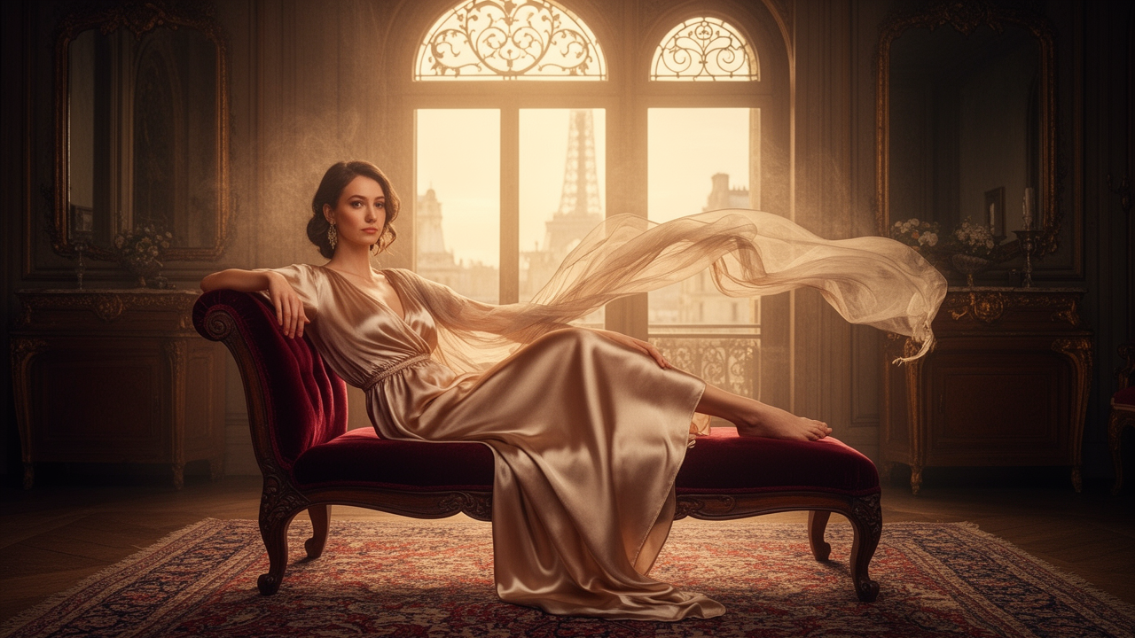
Luxury in these ads was not always about price tags or status symbols. It was about light, space, texture, and composure. Satin reflected lamplight. Glass caught the moon. Perfume lived inside that atmosphere.
This is why so many retro perfume ads still look cinematic. They were designed to feel like a paused scene from a movie that never quite begins.
How copy turned scent into identity
The imagery did a lot, but the copy mattered too. Fragrance advertising learned to speak in suggestion. Instead of technical notes or literal descriptions, copywriters leaned on language that framed perfume as emotional transformation.
Common themes included:
- mystery
- allure
- femininity
- charm
- enchantment
- sophistication
- allure at night
- the thrill of being remembered
The language often used short, confident lines that felt like a whisper and a verdict at once. It was less about what the perfume contained and more about what it enabled. The buyer was being told that scent could change how others perceived her, and perhaps how she perceived herself.
That’s the crucial move in retro perfume ads: they sold not just fragrance, but social presence.
A woman wearing the perfume might become:
- more intriguing in a crowded room
- more elegant without effort
- more feminine in a way that seemed natural rather than performed
- more desirable while still seeming tasteful
This is classic aspiration marketing, but perfume ads gave it a particularly intimate form. Since scent is close to the body, the ad had to make identity feel equally close.
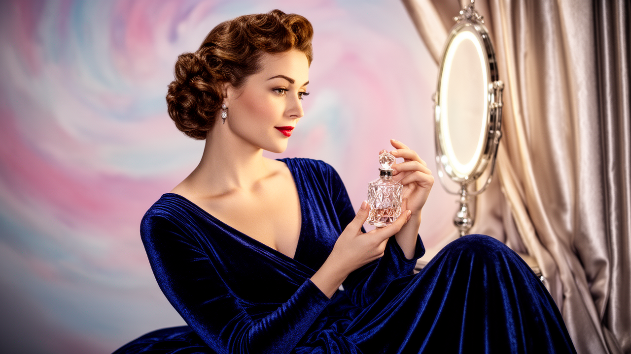
The bottle as a luxury object
Even when the bottle was small, its design had to carry authority. In retro perfume ads, bottles were often treated like jewelry, sculpture, or a keepsake from a more refined world. Shape mattered. Glass mattered. Caps, ribbons, gold accents, and contours all helped the product look worthy of a vanity table.
The bottle was rarely isolated as a utilitarian container. Instead, it appeared as a prized object nestled among other symbols of taste: satin fabric, flowers, mirrors, evening gloves, pearls, and powder compacts.
This visual arrangement taught an important lesson. Luxury was not only a matter of ownership. It was a matter of arrangement.
The bottle might be tiny, but the world around it made it feel expensive. In that sense, the ad created a whole ecology of glamour.
Femininity as a script you could enter
The most revealing thing about retro perfume ads is how carefully they staged femininity. The ads rarely portrayed womanhood as spontaneous. Instead, they presented it as a performance with the right cues.
A woman could be:
- soft but self-possessed
- mysterious but not unreadable
- romantic but not naive
- elegant but not untouchable
- sensual but still socially acceptable
That balance mattered. The ads were selling fantasy, but they had to keep it within the boundaries of respectability. Perfume became a way to edge toward seduction without violating the era’s rules about propriety.
This is why the ads often feel so coded. A glance is never just a glance. A dress is never just a dress. A perfume bottle becomes a prop in a larger script about how femininity should move through public space.
Why these ads still linger in the cultural memory
Retro perfume ads remain visually sticky because they made advertising look like art while keeping the sales message clear. They understood that glamour is persuasive when it appears effortless. They also understood that women’s fragrance was not only about smelling good. It was about how a woman wanted to be seen — or imagined.
That combination of elegance and implication still shapes beauty marketing today. Contemporary campaigns still borrow the same ingredients: soft light, confident posture, cinematic color, and the promise that a scent can signal a whole identity.
But the retro version has a special charge. It feels more deliberate in its construction, more openly symbolic. You can see the machinery of aspiration at work. The ad is not pretending to capture reality. It is building a better one.
For marketers, that is the lasting lesson. The strongest fragrance advertising does not describe perfume. It dramatizes the social life around it.
What retro perfume ads teach modern brands
There is a reason these images still get shared, archived, and imitated. They offer a clean lesson in visual branding:
- make the invisible feel tangible through atmosphere
- use fashion cues to imply a larger lifestyle
- keep the copy suggestive rather than over-explanatory
- treat the product as part of a social ritual, not just a commodity
- let composition, not clutter, carry the sense of luxury
Modern fragrance branding often leans on minimalism, but the older ads remind us that minimalism alone is not enough. You still need desire, and desire needs a scene.
That scene can be glamorous, restrained, romantic, or mysterious. What matters is that it gives the audience a role to imagine for themselves.
Final thought
Retro perfume ads sold more than scent. They sold the feeling that glamour could be entered, worn, and remembered. Through illustration, celebrity shine, and dreamlike art direction, they turned fragrance into a visual promise: the right scent could change your whole presence.
If you’ve got a favorite perfume ad era, brand, or image that still stands out to you, share it in the comments — I’d love to hear what examples you remember most.