
The counter was never just a counter
The best retro soda fountain ads did not merely describe a beverage. They staged a social world around it. A fountain drink was presented as something you ordered after school, split with a friend, or lingered over at a chrome counter until the ordinary day felt a little more festive. The real pitch was not just sweetness or fizz. It was belonging.
That is what made soda fountain imagery so durable. These ads understood that appetite is rarely only about flavor. It is also about setting, company, timing, and the small theatrical pause before the first sip. A glass on a mirrored tray could suggest refreshment. A booth, a stool, or a diner window could suggest membership in a scene that looked modern, youthful, and easy to join.
Why retro soda fountain ads felt like an invitation
Fountain advertising worked because it sold a ritual people already recognized. The trip to the counter had its own rhythm: choose a flavor, watch the mix, wait for the glass to arrive, then settle into conversation. Ads turned that familiar sequence into a miniature performance of American everyday life.
Instead of isolating the drink, the best campaigns framed it as part of a public comfort system. The store, diner, or lunch counter became a setting where a treat was both personal and social. That duality mattered. A soda float or malt could feel indulgent without seeming extravagant because the scene around it stayed casual, accessible, and bright.
A few recurring cues did a lot of work:
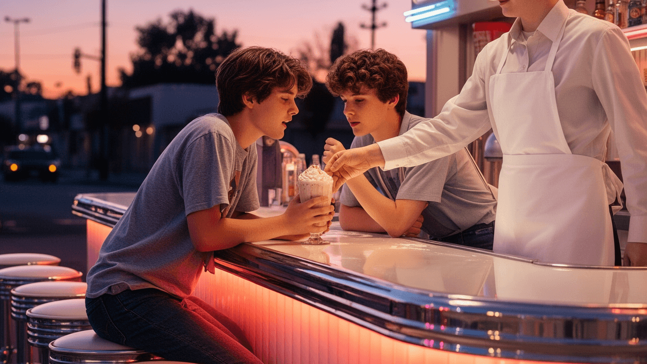
- Chrome counters and mirrored surfaces made the scene feel clean, modern, and alive with reflection.
- Bar stools and booths turned the act of buying a drink into a shared pause.
- Servers in aprons added human warmth and a sense of service without fuss.
- Pairs and small groups implied friendship, flirting, and easy belonging.
- Pastel colors and red accents gave the imagery appetite appeal while keeping it cheerful.
The fountain became a social stage, and the ad invited the viewer to step onto it.
Shared treats, not solitary consumption
A surprising strength of fountain ads is how often they framed the product as a shared treat. Even when the ad featured a single glass, the surrounding composition usually suggested company. Two straws. Two stools. A tray meant to be placed between people. A young couple leaning in. A group mid-laugh over dessert drinks.
That matters because shared eating and drinking naturally create a sense of occasion. The ad did not need to say “celebrate” if the image already showed an after-school stop, a Saturday outing, or a quick date at the counter. The malt or phosphate became a prop in a small social script.
This is one reason retro soda fountain ads still feel emotionally legible today. They capture a format that was both ordinary and slightly ceremonial. A fountain drink was cheap enough to be habitual, but special enough to mark the moment.
Youth culture and the promise of being seen
Soda fountain imagery is inseparable from youth culture because it so often places young people at the center of the frame. Not children, not adults at work, but teens and young adults in that energetic middle zone where identity feels newly visible.
The ads sold more than sweetness. They sold the idea that the fountain was one of the places where modern young people gathered, relaxed, and looked current. The counter did what today’s café or smoothie bar does in another form: it signaled that you were in the right place, among the right crowd, at the right time.
This is where composition mattered so much. A well-built fountain ad often used:
1. Diagonal sightlines
People leaning toward each other made the scene feel spontaneous and social.
2. Open framing
The viewer was not shut out. There was always room to imagine taking the empty stool or sliding into the booth.
3. Motion around stillness
A hand reaching for a glass, ice cream being ladled, or a server arriving with a tray gave the image a tiny narrative pulse.
4. Color contrast
Bright beverages stood out against chrome, tile, and dark uniforms, making the drink look vivid and desirable.
The youth appeal was subtle but powerful: the fountain was not just a place to buy something. It was a place where being there mattered.
How color made the treat look like a mood
If the social setting sold belonging, color sold feeling. Fountain ads often leaned on cream, pink, cherry red, mint, turquoise, and amber tones that made the page feel cool, sweet, and cheerful at the same time. The drink might be dark and glossy in a tall glass, or pale and foamy under whipped cream. Either way, the palette was engineered to suggest refreshment with personality.
The best ads understood that color could carry a whole emotional script. Reds suggested appetite and energy. Pale blues and greens suggested cleanliness and modern ease. Warm yellows and creams softened the scene into comfort. Together, they made the fountain feel both glamorous and approachable.
Even black-and-white ads, when they worked well, used contrast to similar effect. Glossy highlights on glass, the shine of a chrome counter, and the dark foam of a malt could produce a sense of texture that almost made the drink tactile on the page.
The diner and the lunch counter as democratic fantasy
One reason fountain advertising has such long afterlife is that it sits inside a broader fantasy of public sameness. The diner or lunch counter promised a world where different people could sit near one another, order from the same menu, and share the same rituals.
That democratic feel was central to the appeal. The ads rarely stressed luxury. They stressed access. The drink was inexpensive enough to feel everyday, but the setting made it look polished. You could imagine stopping in after a movie, between errands, or after class. The fountain was not a destination for the elite. It was a neighborhood pleasure.
This made the ads especially effective at selling nostalgia before nostalgia became the point. The scene itself carried memory: the clink of glasses, the swirl of a spoon, the short wait before service, the quick exchange at the counter. Those details did not just depict consumption. They depicted a way of living together in public.
Malts, sodas, and the choreography of appetite
A lot of fountain advertising relied on visual choreography. The beverage was never alone. It arrived with a spoon, a straw, ice cream, a cherry, a whipped peak, or a polished tray. Those extras were not decoration in a casual sense; they were part of the sales logic.
Why? Because fountain drinks sit at the intersection of refreshment and dessert. They are too playful to be plain soft drinks, yet too casual to feel like formal sweets. Ads exploited that in-between quality. A malt could be framed as a meal break, a reward, or a little celebration without any of those labels needing to be printed on the page.
The best illustrations made the act of drinking look sequential:
- Notice the glass.
- Register the foam, color, and garnish.
- Imagine the cold first sip.
- Picture the company around it.
That progression is why fountain ads could feel so appetizing even when they were trying to sell atmosphere first.
What these ads knew about nostalgia
Today, people often look at fountain imagery and see a shorthand for “simpler times.” But the original ads were not simply looking backward. They were selling modern life in a form that felt manageable, sociable, and bright.
The nostalgia arrived later, once diner culture and soda fountains became markers of another era. Still, the ads themselves were already building an archive of desire: youthful faces, shiny fixtures, easy conversation, and treats that looked like they belonged to everyday life rather than rare occasions.
That is why the imagery endures. It is not only about a specific product. It is about a scene that feels complete. A fountain drink in these ads is never just consumed; it is witnessed, shared, and socially validated.
Why retro soda fountain ads still work as visual reference
For designers, marketers, and collectors, this category remains useful because it shows how to build appetite without shouting. The ads succeed through atmosphere, not noise.
They remind modern teams that a product image can carry several layers at once:
- a flavor cue
- a social cue
- a lifestyle cue
- a memory cue
- a pace-of-life cue
That layered approach is one reason retro food and beverage campaigns still influence contemporary branding. They know how to make a simple item feel like a small cultural event.
If you want to compare that technique with other categories, it helps to look at how different products sold not just function but identity. Some ads made a drink feel glamorous, some made a radio feel prestigious, and some made a beer feel like the badge of leisure. Fountain ads did their own version: they made a shared treat feel like belonging you could order at the counter.
The lasting appeal of the fountain scene
The power of retro soda fountain ads comes from their ability to compress a whole social world into one frame. A glass, a stool, a smile, a tray, a counter, and a room full of reflections are enough to tell the story. The product is the excuse. The scene is the promise.
That promise still resonates because it names something people continue to want: a place where a small treat feels like a good reason to stay a while.
If you have a favorite soda fountain ad, diner illustration, or malted-drink image, share it in the comments and tell us what makes it stick with you.