
Image credit: oskay via Openverse / Flickr · CC BY 2.0 · License
How retro cereal ads turned breakfast into a test of good parenting
Retro cereal ads were never just about cereal. They were about the kind of parent you were supposed to be before the school bell rang. In the bright, cheerful world of breakfast advertising, a box of flakes, puffs, or toasted O’s was presented as more than an easy meal. It was a small but decisive act of care: nutritious, orderly, and modern enough to keep the family day from unraveling before it began.
That is what makes these ads so revealing. They didn’t only chase children with mascots, games, and sugar. They reassured adults that buying cereal was the responsible choice. Convenience was dressed up as virtue. Sweetness was made to look like balance. And a rushed weekday morning was recast as a stage on which good parenting could be seen in action.
Breakfast was sold as moral housekeeping
The strongest thread in retro cereal ads is not really flavor. It is control.
Breakfast advertising often treated the morning as a fragile domestic system that could either run smoothly or descend into noise, mess, and delay. Parents were shown as managing a small household performance: waking children, feeding them, getting them to school, and somehow doing it all without stress. Cereal fit that story perfectly because it could be poured fast, served cleanly, and framed as a complete solution.
This was a powerful pitch because it collapsed several parental anxieties into one easy purchase:
- Is the child getting enough nutrition?
- Will breakfast be fast enough for a weekday routine?
- Can the morning feel calm instead of chaotic?
- Does this choice reflect care rather than laziness?
Cereal advertising answered all four at once. A box on the pantry shelf became a kind of proof that the parent had thought ahead. The product was not just food; it was evidence of competence.
How retro cereal ads used kids to convince adults
The child was usually the visible star, but the real audience was the adult standing in the kitchen.
That is why so many ads paired child-friendly spectacle with parental reassurance. Mascots, comic strip art, animated antics, and exaggerated sweetness pulled kids in. At the same time, copy and imagery leaned on words like wholesome, nourishing, fortified, and energizing. The ad had to satisfy two different viewers at once. Children wanted fun. Adults wanted permission.
This split-screen approach gave cereal brands a durable formula. The product could be playful without looking irresponsible. It could be sugary without seeming indulgent. It could feel like a reward for kids while still reading as a sensible household staple.
In practice, that often meant the ad showed:
- a cheerful child racing to the table;
- a smiling parent approving the choice;
- a bowl of cereal beside milk and fruit;
- and a visual cue that the whole family was starting the day correctly.
The message was subtle but firm: a good breakfast begins with the right purchase.
The promise of vitamins made sugar seem safer
One of the most interesting tensions in retro cereal ads is how openly they leaned on sweetness while insisting on nutrition.
This was the balancing act at the heart of the genre. The cereals themselves were often heavily sweetened or marketed with kid-pleasing flavor, but the ads repeatedly pointed to vitamins, minerals, and fortification as a kind of moral counterweight. If the product was fun, the vitamins made it responsible. If it was colorful, the nutrition made it respectable.
For parents, that mattered. Breakfast had long been attached to the idea of building strength, concentration, and discipline. Cereal advertising tapped into that belief and made it feel modern. A bowl of cereal could supposedly help children face school, behave better, and start the day with the right kind of energy.
The nutritional claim did more than justify the product. It softened the guilt that came with buying something children loved. That is why so many retro cereal ads feel less like food announcements and more like negotiations between pleasure and duty.
Mascots gave breakfast a friendly authority
Mascots were not just decoration. They were the emotional engine of many cereal campaigns.
A mascot could make a cereal feel alive, memorable, and part of a child’s imaginary world. But mascots also served another function: they made the brand seem trustworthy through repetition and friendliness. If a character showed up every morning in the same bright, upbeat way, the cereal itself inherited that reliability.
For children, mascots created desire. For parents, they suggested that the brand understood family life and knew how to speak to children without becoming threatening or unruly. That mattered in an era when advertising often tried to appear wholesome even while aggressively selling.
The mascot softened the commercial pitch. It gave the product a face, a tone, and a sense of ritual. Breakfast was no longer just food; it was a recurring scene with familiar characters and a predictable outcome. In a culture that prized routine, that predictability was part of the sell.
Family scenes made convenience look loving
The most effective retro cereal ads rarely showed only the cereal.
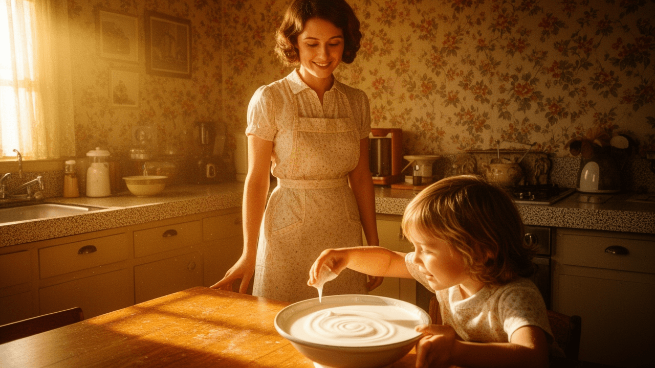
They showed the cereal in use, inside a warm household setting where the parent-child relationship could be read instantly. A mother setting out bowls. A father approving the day’s start. Siblings seated together before school. These scenes were carefully ordinary, and that ordinariness was the point.
The ads suggested that the best kind of breakfast was one that preserved harmony. No fuss, no argument, no delay. Cereal became a tool for reducing friction in the home. The parent who chose it was not taking the easy way out; the parent was protecting the family mood.
That is a subtle but important shift. Convenience was not sold as shortcut culture. It was sold as emotional responsibility.
In these ads, a calm kitchen meant a better day ahead. Breakfast became a small domestic ritual with moral weight.
Why the morning mattered so much
Morning is a useful advertising stage because it compresses time.
There is less room for improvisation in the morning than at other meals. Everyone is tired. The clock is visible. Children may be distracted, slow, or stubborn. That pressure gave cereal advertisers a perfect opening. If a product could make mornings easier, then it could claim a place in the family’s most stressful routine.
Retro cereal ads understood this and used it to frame breakfast as a daily test. The right cereal was not merely convenient; it was capable of preserving order under pressure. And order, in these ads, was always tied to care. The parent who had breakfast under control was a competent parent.
This is why the genre feels so revealing now. It shows how consumer goods were woven into parenting ideals. Buying cereal was never only about taste or price. It was about reducing chaos, staying ahead of the day, and making the household feel properly managed.
What the ads left unsaid
For all their cheer, retro cereal ads were selective storytellers.
They rarely lingered on how processed many cereals were, how much sugar some contained, or how quickly children might tire of the same box on the shelf. Instead, they emphasized a fantasy of balance. A bowl could be both fun and good. A product could be both modern and maternal. A sweet breakfast could still count as a serious act of care.
That selective storytelling is what gives the ads their lasting power. They were not selling ingredients; they were selling reassurance. They offered parents a way to feel thoughtful without slowing down, loving without overcomplicating, and practical without seeming cold.
The cereal box was a shortcut, but the ads insisted it was also a value statement.
Why the parenting pitch still feels familiar
The formula behind retro cereal ads never disappeared. It simply changed shape.
Modern food marketing still talks to parents in the language of convenience, nutrition, and family peace. It still uses child appeal to drive desire and adult reassurance to close the sale. The vocabulary may have changed, but the emotional structure remains recognizable: the right breakfast means the family starts well, and starting well means being a good parent.
That is why these old ads remain so interesting. They are not just cheerful artifacts from a brighter-looking era. They are blueprints for how consumer culture turns everyday parenting into a series of decisions that can be measured, judged, and improved with the right product on the table.
In the end, retro cereal ads were selling more than breakfast. They were selling the feeling that a parent had done the first important thing right.
If you remember a favorite cereal campaign, mascot, or breakfast ad from this era, share it in the comments—I’d love to hear what stood out to you.