


The real product was permission
The most interesting thing about retro cigarette ads is that they so often acted like they were selling something other than cigarettes. The pack might sit in the corner of the layout, but the real message lived elsewhere: in a doctor’s white coat, an athlete’s physique, a military uniform, or a clean, controlled room that felt more like a waiting area than a warning label.
That’s the trick these ads perfected. They didn’t lean on panic or guilt. They borrowed legitimacy from institutions people were taught to trust. If a cigarette could be placed near medicine, discipline, or service, then the product itself could seem less like a risk and more like a normal part of adult life.
The result was persuasive in a way that still feels unsettling now. These ads turned danger into décor. They wrapped a habit in authority and made it look almost civic.
Why retro cigarette ads leaned on trust signals
Cigarettes were never easy to sell on taste alone, especially once health concerns started surfacing more visibly in public conversation. So advertisers reached for something stronger than flavor claims: social reassurance.
They understood a basic truth of print advertising. People do not just buy products; they buy the feeling that the product belongs in their world. If an ad can make a behavior seem normal, disciplined, or approved, it can soften resistance before the viewer even thinks about risk.
That is why so many campaigns used:
- Doctors and medical settings to imply caution, knowledge, and endorsement
- Athletes to suggest fitness, vitality, and performance
- Military imagery to signal duty, strength, and masculine credibility
- Professional interiors that made smoking look neat, modern, and controlled
- Clean typography and careful layout that borrowed the visual order of trustworthy institutions
These were not random styling choices. They were confidence machines.
The doctor’s office pitch: authority in a white coat
Among the most effective devices in retro cigarette ads was the medical cue. A doctor, nurse, or clinical setting could instantly change the emotional temperature of the ad. Instead of asking viewers to consider danger, the ad invited them to feel reassured that a grown-up expert had already done the thinking.
The visual grammar was usually straightforward:
Clinical spaces
White backgrounds, bright lighting, and spare interiors suggested purity and control. The cigarette appeared in a setting that looked managed, measured, and almost sterilized.
Professional gestures
A doctor leaning in, examining, or speaking calmly with a patient signaled care without alarm. The ad framed smoking as something that could fit into a rational, supervised routine.
Serene copy and restrained design
The language often sounded measured rather than exuberant. That restraint mattered. In advertising, calm can function like evidence.
The deeper effect was psychological. If the ad looked medically informed, then the viewer could borrow that confidence for themselves. Risk became something distant, abstract, and politely deferred.
Athletes and the illusion of healthy proof
Sports imagery gave cigarette brands a different kind of credibility. Doctors offered expertise; athletes offered embodiment. They made the body itself look like proof.
The logic was seductive: if someone strong, lean, or accomplished could smoke and still appear energetic, then smoking must not be that serious. In other words, the ad asked viewers to mistake charisma for evidence.
Athletic imagery did a few jobs at once:
- It linked smoking to performance rather than decline
- It suggested discipline and self-control, even when the product itself worked against both
- It gave cigarette brands a masculine sheen without needing overt bragging
- It made the act of smoking look like a pause earned by effort
This is where the visual style matters. A polished athlete, clean lines, and a composed posture all worked together to create an image of health without insisting on it too hard. The ad did not need to prove cigarettes were beneficial. It only needed to imply that successful people used them and kept moving.
That implication was enough.
Military imagery and the language of duty
Military imagery added another layer of authority. Uniforms, disciplined poses, and orderly settings suggested endurance and seriousness. Cigarettes in this context were not presented as indulgent; they were framed as compatible with service, stamina, and responsibility.
This mattered because the military carries a built-in aura of sacrifice and legitimacy. If a cigarette ad could borrow that atmosphere, it could make smoking feel less like self-gratification and more like part of a hard, adult world.
The visual cues were often subtle:
- Crisp uniforms
- Straight posture
- Group scenes with hierarchy and order
- Darker, grounded palettes that felt official rather than playful
- Masculine environments where smoking seemed incidental, not performative
That last point is important. The best authority-based ads often made the cigarette feel like background detail. The more casually the product fit into a scene of duty or command, the less the viewer was prompted to question it.
Clean design made the message feel trustworthy
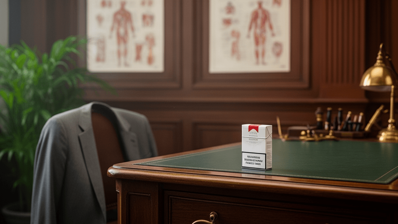
The authority in retro cigarette ads was not only in the subject matter. It was also in the design language.
Midcentury print advertising often favored clarity, balance, and restraint. That style was ideal for selling trust. Clean typography, generous spacing, and polished compositions made an ad feel organized and competent. Those visual qualities could subtly transfer to the product itself.
A few design habits show up again and again:
Symmetry and control
Balanced layouts made the ad look composed. That composure helped erase the messiness associated with addiction or health risk.
Sparse backgrounds
By reducing visual clutter, the ad could isolate its authority figure. A doctor, athlete, or officer looked more convincing when nothing competed for attention.
Soft contrast and elegant framing
The cigarette package often sat inside a world of tasteful surfaces, suggesting that the product belonged among respectable objects rather than problematic ones.
Modernist confidence
The typography and grid-like organization often borrowed from the same design instincts that made appliances, cars, and professional services feel efficient and modern.
In short, the ad’s visual order did some of the same work as the authority figure inside it. It made the whole proposition seem deliberate.
Smoking as a social performance
Another reason these ads worked is that they made smoking look socially smooth.
Nobody in them appeared awkward, unprepared, or unsure. The cigarette was an accessory to poise. It belonged in lounges, offices, locker rooms, and military-adjacent scenes because those environments already carried codes of competence and belonging.
That social framing mattered more than the product copy. The ads suggested that smoking was what adults did when they had earned a moment of calm. It was a ritual of composure, not a chaotic habit.
This is why the ads rarely felt frantic. They were patient. They let the viewer absorb a mood:
- composed
- masculine
- expert-backed
- institutionally familiar
- quietly prestigious
Once that mood took hold, the cigarette did not need to be defended directly. It only needed to feel like the sort of thing people with confidence would naturally hold.
What these ads reveal about persuasion
The lasting lesson of retro cigarette ads is that persuasion often works best when it disguises itself as common sense.
These campaigns did not shout. They borrowed. They borrowed from medicine to suggest safety, from sports to suggest vitality, and from military imagery to suggest discipline and honor. Then they wrapped the whole thing in calm layouts and professional polish so the message would feel earned instead of forced.
That is why they still stand out today. Not because they were honest, but because they were so good at making reassurance look like evidence.
Seen now, the ads are a reminder that visual trust can be engineered. A white coat, a uniform, a clean line of type, a carefully chosen pose — each one can help a product borrow credibility it has not actually earned.
And that is what makes this corner of advertising history so revealing. It shows how easily authority can be staged, and how quickly a risky product can be made to look socially acceptable when the framing is just right.
The bottom line
Cigarette brands did not simply advertise a habit. They advertised the feeling that the habit had already been approved by the people and institutions viewers respected most. Doctors, athletes, and military imagery gave smoking a borrowed seriousness that softened doubt and dressed up risk as routine.
If you want a sharper look at how persuasion evolved across this era of print advertising, the cigarette page is one of the clearest examples around.
What do you think made these ads so effective — the authority figures, the design, or the social status they implied? Share your take in the comments.