
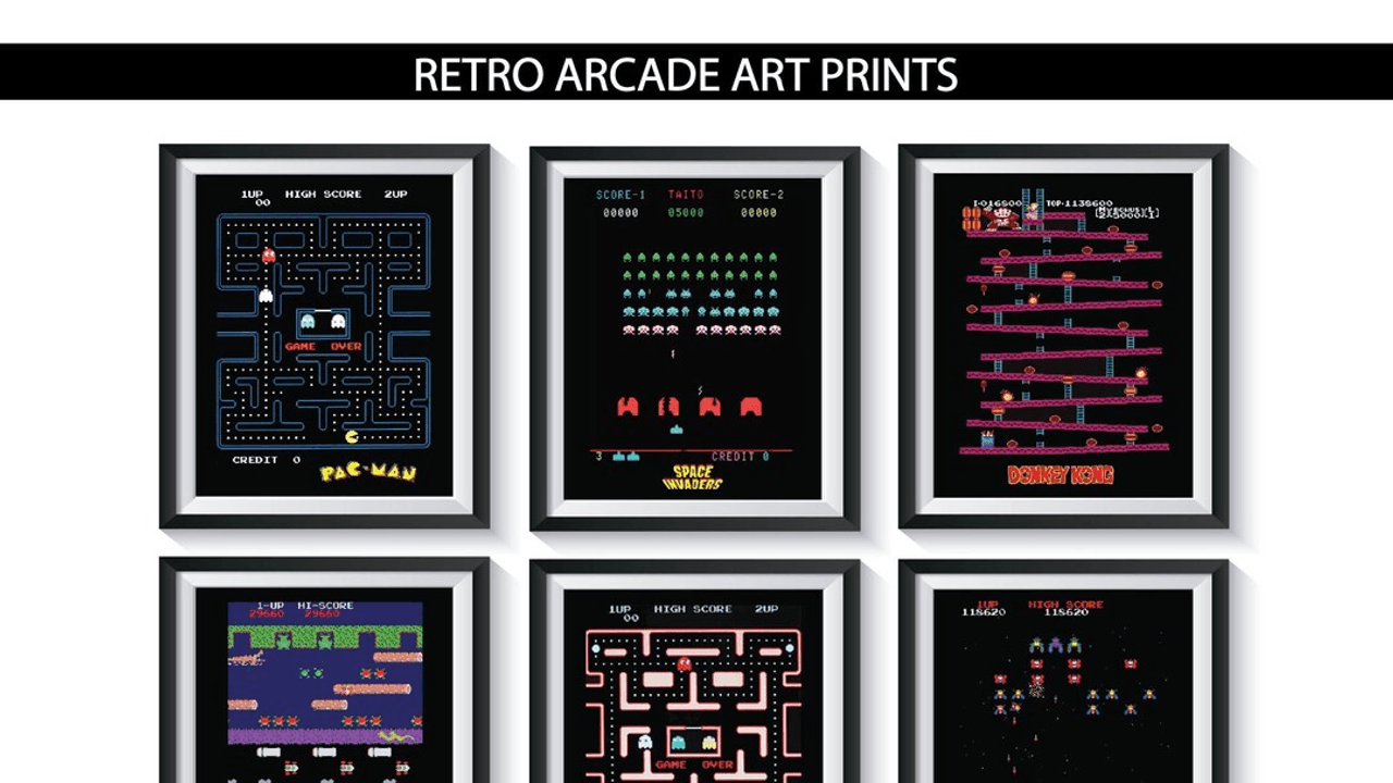
Image credit: Draft web reference from etsy.com
Arcade game artwork wasn’t decoration added at the end. It was the first pitch. Before the controls, before the sound effects, before a player knew whether the game was a shooter, brawler, racer, or fantasy quest, the cabinet was already making a promise. A flash of color, a heroic stance, a monster looming at the edge of the frame: that was the sales job. Good arcade game artwork had to stop a person mid-walk, communicate the machine’s identity in seconds, and make the fantasy feel worth a quarter.
That’s why the best cabinets were never visually shy. They used oversized characters, aggressive diagonals, bright contrast, and instantly legible silhouettes. They understood that an arcade floor is chaos. Every machine is competing with noise, motion, and light. The art had to win attention fast, then keep earning it once someone got closer.
Arcade game artwork had one job: sell the first look
At street level, the cabinet was a billboard you could play. The artwork was doing several jobs at once:
- announcing genre
- hinting at tone
- creating a memorable identity
- implying scale and action
- separating one machine from the next
That combination mattered because the player rarely approached with prior knowledge. In the late 1970s and 1980s, many arcade visitors were making a split-second decision based on what they saw from across the room. If the game looked like a space battle, a martial-arts showdown, or a monster hunt, the art had to make that plain immediately.
The smartest artwork did not merely show “what happens.” It showed what it feels like to want in. That distinction is the secret behind so many unforgettable cabinets. They were selling fantasy before they were selling mechanics.
Readable silhouettes beat visual clutter
The best cabinet art tends to be easy to read at a distance. A strong silhouette does a lot of heavy lifting. A fighter with a raised fist. A spaceship angled upward. A giant creature with claws spread wide. These shapes tell the eye where to land.
Arcade game artwork often relied on three visual tricks:
- Clear central figures so the cabinet had an immediate focal point.
- Diagonal motion to suggest speed, danger, or impact.
- High contrast color to pop under harsh fluorescent arcade lighting.
That approach made sense because arcade floors were visually crowded. If the art was muddy, too detailed, or too small in its gesture, it disappeared. A good cabinet could be recognized in a glance and remembered after a single pass.
Marquee art was the cabinet’s nameplate and headline
The marquee sat at the top of the machine like a storefront sign. It had to do two things at once: identify the game and reinforce the mood. Even when the title text was the most important element, the surrounding illustration mattered. Flames, steel, stars, fangs, speed lines, armor, and lightning all worked as genre cues.
This is where arcade game artwork became especially persuasive. The marquee wasn’t content to label the experience; it dramatized it. A space game didn’t just have a spaceship. It had an attack posture, a beam trail, and a sense of forward momentum. A fantasy game didn’t just have a swordsman. It had a looming threat, an enchanted landscape, or a monster waiting just beyond the frame.
The marquee’s job was to make the machine feel alive from eye level.
Side panels extended the fantasy
If the marquee was the headline, the side art was the world-building. Side panels gave artists room to stretch the theme across the cabinet body, turning a rectangular box into a moving scene. On a good cabinet, the side illustration wasn’t a repeat of the front; it was an extension of the fiction.
That mattered for two reasons. First, it made the machine feel larger and more complete. Second, it helped the cabinet maintain identity from different angles. In a busy arcade, you might only see a machine in profile as you passed. Side art ensured the game remained recognizable even before the control panel came into view.
The most effective side panels often included:
- dramatic characters in profile
- weaponry or vehicles with sharp outlines
- environmental texture like clouds, fire, stone, or circuitry
- color blocks that echoed the marquee and bezel
The cabinet became a kind of stage set. The art wrapped the hardware in narrative.
Cabinet illustrations turned hardware into character
A plain cabinet is just a box. Arcade game artwork gave that box attitude.
That attitude was crucial because the arcade was full of machines that needed to feel distinct. The art established personality before the first coin ever dropped. One cabinet might look sleek and futuristic. Another might feel savage or cartoonish. Another could sell heroic adventure through painterly fantasy imagery. In each case, the cabinet became a character of its own.
That visual personality was not accidental. Designers and illustrators understood the psychology of attraction. People are drawn to faces, gestures, and scenes of conflict. So the art leaned into bold expressions and tense compositions. Even when the game itself was simple, the cabinet could make it feel mythic.
This is one reason collectors care so deeply about original art today. A restored board is meaningful, but a cabinet with intact side art, marquee, and bezel tells a fuller story. The machine is not just playable; it is visually authentic.
Genre cues did the selling before the player knew the rules
A good arcade cabinet art package instantly told you what kind of thrill you were buying. That language included:
- Fantasy cues: swords, castles, dragons, capes, glowing relics
- Sci-fi cues: starfields, lasers, armored pilots, alien silhouettes
- Action cues: clenched fists, explosions, motion lines, danger close to the frame
- Sports and racing cues: speed blur, vehicles in aggressive angles, motion-heavy composition
- Horror cues: shadows, fanged creatures, ominous color palettes, exaggerated fear
That was practical design, but it was also marketing theater. The cabinet art made a promise that the game itself then had to keep.
Why this visual language still matters to collectors and fans
People who collect cabinets are often preserving more than electronics. They’re preserving a complete visual object. Once the art is damaged, faded, or replaced with generic reproductions, the machine loses some of its original force. You can still play the game, but the fantasy has been partially edited out.
That’s why arcade game artwork matters so much to preservation-minded fans. It preserves context. It preserves the era’s taste for maximalism. It preserves the specific way a machine was meant to be encountered in public.
Collectors notice the difference immediately. Original art can reveal:
- the intended mood of the game
- period-specific illustration style
- manufacturer branding choices
- regional differences in design
- wear patterns that tell the machine’s history
In other words, the art is historical evidence. But it’s also emotional evidence. It shows how the machine was supposed to feel before modern nostalgia turned it into an artifact.
The art holds up because it was designed for attention, not subtlety
A lot of arcade graphics aged better than people expect because they were built for instant legibility. That can look almost modern now. The best pieces have the same advantages that strong poster design does: a central image, a controlled palette, and a clean idea.
That’s also why the art still resonates with fans who never played the original cabinet in a real arcade. The visuals communicate a specific attitude: daring, loud, unabashed, and confident. They don’t apologize for trying to be noticed.
The cabinet was part advertisement, part promise
What makes arcade game artwork so fascinating is that it sits between art direction and consumer persuasion. It had to function as a public-facing image, a theme statement, and a piece of machine identity. Few forms of game marketing had that much pressure on them.
A home game could be sold with a box on a shelf. An arcade machine had to compete in motion, at distance, under bad lighting, with other machines shouting for attention. The artwork wasn’t just decorative surplus. It was infrastructure for desire.
That’s the core of the appeal. The art wasn’t merely about looking cool; it was about engineering curiosity. It pulled people closer. It made them ask what kind of adventure was waiting inside.
Why the strongest arcade cabinets feel unforgettable
The most memorable cabinets share a few qualities that still make design sense today:
- a single dominant idea
- a clear emotional tone
- strong visual contrast
- a figure or shape you can recognize instantly
- enough narrative suggestion to spark imagination
When all of that comes together, the cabinet does something remarkable. It becomes a memory before it becomes an experience.
That is why arcade game artwork still has such staying power. It is tied to a specific era of public gaming, but its visual logic is timeless. Bold images. Clear promises. Immediate impact. Those are the ingredients that turn a machine into an icon.
The fantasy started outside the screen
Arcade art reminds us that games were once sold in the real world, on crowded floors, by visual force alone. Marquee art, side panels, and cabinet illustrations weren’t extras. They were the machine’s voice. They told you what the game wanted to be, who it wanted you to imagine yourself as, and why you should stop here instead of at the cabinet next to it.
That’s why the best arcade game artwork still matters. It’s not just nostalgia. It’s design intelligence you can still read at a glance.
If you’ve got a favorite cabinet, a memorable marquee, or a side panel you’d fight to restore, share it in the comments. I’d love to hear which arcade art stuck with you most.