Item pages in old guides can go two ways: useful planning tools or unreadable catalog dumps. The Lego Universe guide lands closer to useful — if you read it with intent. The trick is to stop looking for “best item” and start looking for “best next upgrade path.”
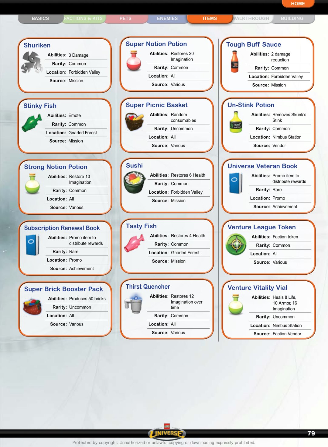
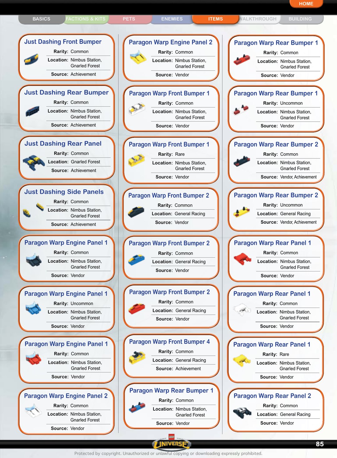
What makes these pages work is structure. You get visual item identity first, then rarity/source context, then details. That order is perfect for route planning because it mirrors how players make real decisions: “Do I recognize it? Can I get it soon? Is it worth my current grind?” When guides answer those in sequence, they save hours of trial-and-error farming.
For modern use, build a quick personal filter: immediate power, near-term accessibility, and role fit. If an item scores on two out of three, it is probably worth targeting now. If not, log it and keep moving. This helps avoid the classic MMO mistake where you chase distant upgrades that stall your whole progression curve.
Another win here is visual consistency. Item entries are compact and recognizable, which makes comparison easy even when the page carries supporting text. Compared to many modern wiki tables, this actually feels less fatiguing to scan over long sessions.
So yeah — these pages are not just nostalgic screenshots. They’re real planning tools if you approach them like a build architect instead of a collector. Use them that way and your runs get cleaner fast.
What this means in practice: treat each item page as a short planning meeting with yourself. Identify one immediate upgrade target, one backup option, and one item to ignore for now. That simple triage cuts analysis paralysis and keeps your run moving. The best builds are not built from perfect information; they are built from consistent, low-friction decisions.
From an editorial perspective, item-grid visuals are gold because they communicate structure quickly. Readers feel oriented before they read a paragraph, which reduces bounce and improves engagement naturally.
Used this way, these pages become less about loot obsession and more about smart progression architecture.
That is the exact standard for this series: useful, visual-first, and grounded in real play decisions.