
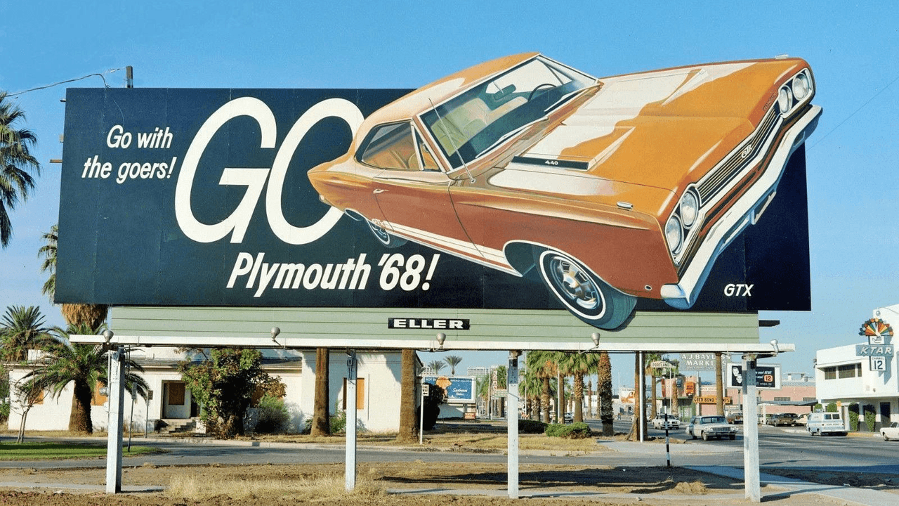
Image credit: Draft web reference from pinterest.com
The billboard was the hardest-working salesperson on the road
Before drivers had dashboards full of notifications, they had mile after mile of open road and one visual interruption after another: retro billboard ads. These signs did something print ads and radio spots could not do as easily. They met people where they were moving, framed by traffic, speed, and routine. And because nobody could scroll past them, skip them, or close them, billboards turned commuting into a kind of enforced brand study.
That was the quiet genius of the roadside format. A billboard had to make its case in seconds, sometimes in less. It could not rely on paragraphs, close reading, or long explanations. Instead, it leaned on size, repetition, and a few carefully chosen visual cues. The result was not just awareness. It was memory.
Why retro billboard ads worked so well on drivers
Billboards were never asking for a full stop. They were asking for a glance. That tiny window changed everything.
A driver at highway speed could only absorb a message that was immediate and legible. So advertisers sharpened their language into blunt, durable cues:
- a bold product silhouette
- a giant price or promise
- a simple slogan with one clear payoff
- a color palette that could be recognized from far away
- a brand mark repeated often enough to become familiar
This is where retro billboard ads became more than outdoor decoration. They functioned like visual shorthand. A familiar shape on a roadside sign could suggest luxury, reliability, fun, or speed before the brain had time to fully process the image. The driver did not need a sales pitch. The driver needed recognition.
And recognition is powerful. The more often a commuter saw the same brand on the same route, the less the ad felt like persuasion and the more it felt like part of the landscape. That familiarity created a subtle advantage: the brand seemed established, present, and worth trusting.
Scale turned public space into private memory
One reason billboard advertising felt so effective in the midcentury period was its sheer physical confidence. A billboard did not whisper. It loomed.
That scale mattered because it changed the emotional tone of the message. Small ads can feel optional. Big roadside signs feel inevitable. They occupy a slice of the horizon and claim attention before the viewer consciously agrees to give it. In that sense, billboards converted public space into private recall. The sign belonged to the roadside, but the memory belonged to the driver.
This is especially important for status-driven products. When a brand wants to feel aspirational, size helps. A massive sign makes the product seem important enough to warrant architectural attention. It can make a car look faster, a beverage look cooler, or a service station look more dependable simply by placing the message in a larger-than-life frame.
That visual authority was the point. Billboard campaigns did not just tell people a brand existed. They made the brand feel like part of modern life’s infrastructure.
The visual grammar of speed and status
Roadside ads lived in a world of motion. That meant their design language had to work at a glance and hold up against blur, glare, weather, and distance.
The best campaigns often shared a few traits:
1. One idea per sign
A billboard had very little time to persuade, so it usually delivered one primary message. That could be a product benefit, a status cue, or a simple emotional association. If the sign tried to do too much, it vanished into traffic noise.
2. Strong contrast
High contrast made signs readable against the sky, trees, or concrete. Bold letters, clean backgrounds, and sharp shapes helped the message survive a moving viewpoint.
3. Symbol over explanation
A sparkling object, a streamlined vehicle, a smiling family, or a gleaming package could say more than a block of copy. The image did the emotional work.
4. Repetition along the route
Seeing a billboard once was exposure. Seeing it every week on the same commute was conditioning. Repetition turned a quick glance into brand memory.
5. Placement near decision points
Billboards near exits, gas stations, diners, and city approaches linked the ad to action. The driver might not buy immediately, but the sign could plant the suggestion at exactly the moment when a choice was about to happen.
Together, these tactics created a kind of roadside theatre. Drivers were not seated and attentive, but they were also not free to ignore the show. The road kept them moving straight through the advertisement.
How repetition made brands feel inevitable
Repetition is a strange tool. Used carelessly, it becomes noise. Used well, it becomes confidence.
That was the real power behind many retro billboard ads: they made certain brands feel unavoidable without ever needing to say so directly. A campaign repeated across multiple routes or regions implied scale, stability, and reach. If a business could afford to plant its message everywhere you went, it seemed successful before you had even tried the product.
That kind of repetition also created a psychological shortcut. People began to trust the familiar simply because it was familiar. The sign on Monday, the same sign on Wednesday, the same sign again on the weekend drive home: the brand started to feel like part of the normal order of things.
And because billboards lived in public space, they also borrowed authority from the environment. A roadside message was not hidden in a magazine spread or tucked away in a store aisle. It was out in the open, exposed to weather and traffic, which gave it a rough, practical legitimacy. It seemed to belong to the real world because it was literally part of it.
Billboards sold more than products
The most effective roadside campaigns were never only about the item being advertised. They sold a mood.
For some brands, that mood was speed. For others, it was modernity, dependability, or social status. A well-placed billboard could suggest that driving this car, buying this drink, or stopping at this business was simply what successful, forward-looking people did.
That’s why so many of these ads feel inseparable from midcentury car culture. They spoke to movement, aspiration, and the sense that the road itself was a theater of identity. The driver was not just traveling. The driver was being addressed as a consumer in motion, someone whose route, choices, and ambitions could be shaped by what flashed by on the shoulder.
In that sense, billboards did something subtle and lasting. They made brand recall automatic. By the time a driver reached town, the ad had already done its work, settling into memory without asking for permission.
What modern marketers still borrow from roadside billboards
Even now, the logic of billboard advertising is everywhere. Short attention spans, high traffic environments, and visual overload are not old problems. They are current ones.
Modern campaigns still borrow from the roadside playbook in a few obvious ways:
- keep the message extremely simple
- make the visual readable at speed
- repeat the core image often enough to stick
- use location as part of the persuasion
- sell a feeling, not just a feature
That is why retro billboard ads still feel so instructive. They were built for a world that was already distracted, already moving, already too busy for long explanations. The ads did not fight that condition. They used it.
And that may be the best lesson of all. When an audience is passing by, clarity becomes a form of power.
The roadside ad as a memory machine
Billboards worked because they understood a simple truth: memory favors what is easy to recognize.
A driver passing a sign at 55 miles per hour was not reading like a shopper in a store. The driver was collecting fragments. A color. A shape. A promise. A repeated route. Over time, those fragments accumulated into brand familiarity, and familiarity could become preference.
That is why these ads mattered so much in the age of the highway. They made the road part of the marketing system. They turned transit time into impression time. And they transformed a public landscape into a private mental archive of brands, promises, and status cues.
So when we look back at roadside advertising, we are not just looking at oversized signs. We are looking at a very efficient machine for turning motion into memory.
If you have a favorite roadside ad, old commercial corridor, or memorable billboard style, share it in the comments—I’d love to hear what stuck with you.