Retro Car Ads and the Visual Grammar of the Open Road
Retro car ads were never just about getting from one place to another. They sold a feeling: the promise that a car could deliver independence, social status, family security, and a future that looked cleaner, faster, and more radiant than the present. The best retro car ads made the automobile feel less like machinery and more like a personal declaration.
That persuasion worked because the imagery was highly coded. Chrome gleamed like jewelry. Long roads suggested freedom. Smiling families implied stability. Sleek fins and low rooflines pointed toward tomorrow. Even when the copy was brief, the visual language did most of the heavy lifting.
Retro car ads and the promise of freedom
One of the most durable ideas in automobile advertising is that a car unlocks life itself. In classic ads, the road is usually empty, open, and slightly idealized. The driver is not trapped in traffic, boxed in by routine, or delayed by inconvenience. Instead, they are headed somewhere brighter.
This is more than scenic dressing. The highway functions as a moral argument. It says:
- You are not confined to your neighborhood.
- You can leave when you want.
- The world is larger if you own the right car.
That was especially persuasive in the middle of the twentieth century, when suburban growth, road building, and a booming consumer economy made mobility feel like progress itself. A car was no longer just a tool. It was access.
The open road also gave advertisers a way to dramatize control. A driver behind the wheel appears self-directed, capable, and modern. The car becomes a private kingdom with a clear horizon. In retro car ads, the road often stretches into a vanishing point not because the destination matters, but because possibility does.
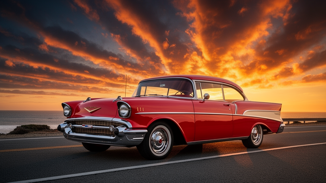
The shine of chrome as visual shorthand
Chrome is one of the great symbols of classic auto marketing because it is both decorative and emotional. It reflects light, catches the eye, and makes an object feel expensive even before any feature list appears. In ad imagery, chrome is rarely incidental; it is the proof of quality, confidence, and craftsmanship.
Advertisers understood that shiny surfaces could do more than show off styling. They could suggest:
- durability
- luxury
- modern manufacturing
- pride of ownership
The effect is almost cinematic. A close-up of a grille or bumper becomes a portrait of power. Chrome strips along the hood or fenders guide the eye and make the body seem longer, leaner, and more elegant. Those reflections also make the car feel alive, as if it is absorbing the world and sending it back in polished form.
This is part of why the cars themselves often look more glamorous in retro ads than they do in ordinary life. The art direction exaggerated every highlight. The metal seemed colder, brighter, and more precise than it could ever be on a cloudy driveway.
How composition sold the automobile as destiny
The layout of classic car advertising was rarely random. It followed a visual grammar designed to make the car look inevitable.
Low angles and heroic framing
Cars were often shot from below or placed slightly above the viewer’s eye line so they appeared dominant. This made a sedan or coupe look substantial without seeming bulky. The message was simple: this machine has presence.
Diagonal motion and forward lean
Even parked cars were often arranged to imply movement. Wheels were turned, roads curved away, backgrounds blurred, and body lines pointed forward. Diagonal composition created urgency. It made the car feel like it was already in motion toward a better life.
Negative space and horizon lines
A wide, empty road or a clean stretch of sky gave the vehicle room to breathe. The emptier the scene, the more the car seemed to stand for opportunity. Negative space was not a design accident; it was a symbol of freedom.
Family-centered staging
When the ad wanted to speak to household stability, the automobile moved into a driveway, a school run, or a weekend trip. Now the car was not a lone hero. It was the center of a dependable domestic story.
These compositions worked because they made the vehicle readable at a glance. You did not have to inspect every feature. You understood the emotional pitch instantly.
The family success angle: car ownership as proof of arrival
A huge part of automobile persuasion was social. Owning the right car meant you had made it.
Classic ads repeatedly linked cars to a well-ordered life: a smiling spouse, children in clean clothes, a house with a neat lawn, a vacation without stress. The vehicle sat at the center of this image of achievement. It signaled that the owner had not only earned comfort but also chosen wisely.
This was especially potent in postwar advertising, when mass consumer goods became a language of stability. A new car suggested:
- financial competence
- good taste
- domestic responsibility
- upward mobility
The message was subtle but powerful. If the car looked dependable, then the family looked secure. If it looked stylish, then the household looked successful. The vehicle became a badge of adult accomplishment.
That is one reason retro car ads often feel so emotionally loaded today. They are not simply nostalgic. They document a moment when personal consumption was presented as a public sign of having entered the future.
Speed without chaos
Speed mattered, but advertisers had to sell it carefully. Too much aggression could seem reckless. Instead, they framed speed as smoothness, responsiveness, and effortless control.
The best ads suggested that the car could be fast without feeling dangerous. You saw streamlined bodywork, sweeping lines, and phrases that promised quick acceleration or easy passing power. The actual sensation was not race-track intensity. It was competence.
That distinction mattered. For many buyers, the ideal car was not the flashiest machine on the road. It was the one that made speed feel civilized.
Visual cues reinforced this idea. Motion blur might trail the background while the car remained crisp. Headlights cut through dusk. Tires hugged the pavement. The whole composition said: yes, this vehicle is energetic, but it is also under control.
In other words, speed was marketed as a lifestyle benefit, not a thrill ride.
Futurism in fins, rockets, and streamlined bodies
If freedom was the emotional promise, futurism was the aesthetic one. Classic auto advertising borrowed heavily from the era’s fascination with aviation, space travel, and the machine age.
You see it in:
- tailfins that echo jet wings
- grilles that resemble turbine intakes
- bodies shaped like capsules or projectiles
- sweeping lines that imply aerodynamics even when the car is stationary
This visual futurism made the car look like an object from the next chapter of history. It promised that the buyer would not just keep up with the times but live ahead of them.
The strategy was clever because it linked novelty to authority. A car that looked futuristic also looked inevitable. It seemed to belong to a coming world of better roads, better suburbs, better weekends, and better public confidence.
That future-facing design language gave retro car ads a particular kind of optimism. They were selling tomorrow in the polished shape of today.
Recurring slogans and the language of reassurance
The copy in automobile ads often sounds simple, but its repetition is revealing. Slogans tended to revolve around a few core ideas: value, dependability, comfort, power, and prestige. Even the bolder lines usually avoided complexity. They wanted instant belief.
Common rhetorical patterns included:
- direct address to the reader
- comparisons to older models or rival cars
- claims of smoother ride, better handling, or more room
- repeated emphasis on economy and dependability
- confident statements about style or status
A strong slogan did not need to be clever in a modern sense. It needed to feel reassuring. Car buyers were making a major purchase, and the ad had to reduce uncertainty. The words worked in tandem with the visuals: the road looked open, the car looked superior, and the copy explained why you should trust that impression.
This is also why automobile advertising often used a tone of polished certainty. The ad did not ask whether the car was right for you. It implied that the choice was already obvious.
Why retro car ads made the automobile a cultural icon
The automobile became more than a product because advertising connected it to the biggest social desires of the century. A car was freedom from routine, status in the eyes of others, and participation in a future that seemed to be arriving fast.
The car was also unusually flexible as a symbol. It could stand for youthful independence in one campaign and family responsibility in the next. It could be rugged, elegant, practical, patriotic, or glamorous depending on the audience. That made it ideal advertising material.
Classic auto marketers understood that they were selling a portable version of modern life. The car appeared to solve distance, compress time, and improve identity all at once. That is a powerful pitch, and it explains why the imagery remains so recognizable now.
In retrospect, the visual grammar is almost as important as the vehicles themselves. Chrome, road, horizon, family, motion, future. Those elements formed a shorthand that still reads instantly because it was built from basic human desires.
What modern brands still borrow from the era
Even today, plenty of automotive marketing borrows from the same playbook. You still see open roads, golden light, heroic angles, and a heavy emphasis on lifestyle over mechanical detail. That is because the old formula was not just decorative. It solved a communication problem.
A car is complicated. But a feeling is simple.
The classic ad approach reduced a hard purchase decision to a handful of vivid promises. It told viewers that this machine could transform the way they moved through the world. And when the design, staging, and copy all pointed in the same direction, the message felt almost self-evident.
That is the enduring lesson of retro car ads: if you want to sell transportation, show freedom. If you want to sell metal, show meaning.
For a broader look at how persuasion evolved across the medium, see The Evolution of Persuasion in Retro Advertising. If you want to compare other emotional selling systems, Why Retro Ads Still Work: Mascots, Muscle, Memory is a great companion read.
The most useful takeaway for modern marketers is not to copy the chrome. It is to understand the structure behind the shine. Classic car ads succeeded because they made a product feel like a life upgrade.
And that is still the core of great advertising.
If you’ve got a favorite classic auto ad, a memorable slogan, or a brand that always nailed the open-road fantasy, share it in the comments. I’d love to hear which examples stayed with you.