
Why Retro Food Ads Made Convenience Feel Wholesome
Retro food ads did a remarkable trick: they took canned soup, boxed dessert, frozen entrées, and shelf-stable mixes, then wrapped them in the language of care. The message was never just “buy this.” It was “this is what a smart, modern, loving household chooses.” Convenience was sold as proof of good management, not a shortcut around it.
That pitch mattered because packaged food entered the home at the exact moment American advertising was defining a new domestic ideal. The kitchen was supposed to be efficient, the mother supposed to be composed, the family supposed to be well fed, and dinner supposed to look easy. Ads stepped into that pressure point and turned processed food into reassurance.
The central trick: convenience reframed as responsibility
The genius of packaged food advertising was its refusal to call convenience lazy. Instead, it translated convenience into a kind of household competence.
A can of vegetables was not a compromise. It was “ready when you are.” A boxed cake mix was not an admission that something had been outsourced. It was a reliable way to produce a dessert that looked homemade. A frozen meal was not a sign of diminished care. It was a buffer against chaos.
That shift in meaning is the key to understanding retro food ads. They were not selling ingredients alone. They were selling the feeling that modern life could be managed without sacrificing warmth, routine, or family approval.
Smiling families did the emotional heavy lifting
One of the most persistent images in packaged food advertising is the family seated at a clean table, all faces open, bright, and ready to endorse the product without saying a word. These scenes were carefully staged to make the meal itself look like a social proof machine.
The formula was simple:
- a mother with calm, competent posture
- children who look satisfied rather than merely fed
- a father who appears pleasantly surprised by dinner
- a table that suggests order, abundance, and good taste
The point was not realism. The point was emotional certification. If everyone in the picture is smiling, then the product must be trustworthy. If the family looks relaxed, then the cook must have made the right decision. In that sense, retro food ads sold more than food; they sold a fantasy of domestic harmony with a grocery aisle backbone.
Nutrition claims made modernity look safe
Packaged food ads often leaned hard on nutrition language because modernity needed permission. Processed food could feel suspicious, especially when it was new enough to seem chemically advanced or too easy. So advertisers borrowed the authority of health.
Depending on the product and the era, ads emphasized:
- vitamins and minerals
- fortified ingredients
- energy and strength
- “good for growing children” messaging
- doctor- or expert-adjacent credibility
This rhetoric did two things at once. First, it soothed doubts about processed food by making it sound beneficial. Second, it placed the product inside the moral economy of parenting. If you served the right boxed cereal or canned soup, you were not just feeding people; you were supporting their development.
That is a powerful move. It converts a purchase into a caretaking act.
Pantry abundance was a visual argument all by itself
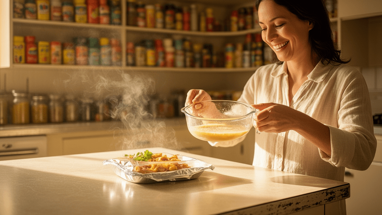
Many retro food ads were packed with shelves, baskets, cupboards, and neatly arranged groceries. Abundance was not background decoration. It was the message.
A full pantry suggested foresight, stability, and financial confidence. It also implied a household that had mastered time. The stocked shelf said, in effect, “this kitchen is ready for whatever comes next.”
That visual grammar mattered because it made packaged food feel like an infrastructure of control. Canned goods and boxed staples were presented as the materials of preparedness:
- meals could happen quickly
- emergencies could be absorbed
- guests could be fed without panic
- the home could look abundant even on a tight schedule
In these ads, abundance was never messy. It was orderly, luminous, and easy to inventory. The shelf became a symbol of well-run domestic life.
Wholesome and modern were not opposites
A lot of food marketing relies on a false choice between tradition and progress. Retro packaged food ads mostly refused that tension. Instead, they suggested that the most modern homes were also the most wholesome.
That was the brilliance of the visual language. Chrome appliances, tidy kitchens, and cheerful packaging could sit next to images of roast dinners, pie slices, or steaming bowls of soup. The effect was to make industrial food feel as if it had been domesticated.
The ad copy often reinforced this balance by combining two promises:
- Speed — dinner is fast, efficient, and uncomplicated.
- Warmth — the result still feels like care, family, and home.
That combination made packaged food uniquely persuasive. It did not ask buyers to choose between modern life and moral comfort. It promised both.
The copy was plainspoken, but the pressure was sophisticated
The language in retro food ads often sounds straightforward at first glance. The sentences are crisp. The benefits are stated plainly. The product appears to be doing the work.
But beneath that simplicity was a sophisticated understanding of household anxiety.
Advertisers knew that busy cooks were juggling limited time, uneven budgets, children’s preferences, and the social expectation that dinner should somehow feel effortless. So the copy usually did one or more of the following:
- promised a shortcut that would still produce a “real meal”
- framed the product as dependable rather than trendy
- reassured readers that quality had not been sacrificed
- linked the brand to happy routines and repeatable success
This is why so many of these ads feel emotionally familiar even now. They recognize the pressure of feeding other people and answer it with certainty.
Processed food had to look lovingly made
Another recurring strategy in retro food ads was the effort to disguise industrial origin without denying it outright. The ad did not usually hide the fact that a product came from a factory. Instead, it made processing seem like a helpful transformation.
That meant emphasizing:
- neat shapes and bright color
- steam or serving cues that suggested freshness
- plated meals that looked composed rather than mass-produced
- kitchen scenes that made the final dish feel personally assembled
The goal was to make convenience look like craftsmanship. Even when the product was obviously engineered for speed, the ad wanted the final plate to seem as if it had passed through a nurturing hand.
This was especially effective for products like soup, cereal, gelatin desserts, and cake mixes, where the advertising could show a quick assembly process that ended in something polished and pleasing.
The home economist was the era’s quiet authority
Many packaged food ads borrowed the voice of expertise without always using a doctor’s coat or a laboratory backdrop. Sometimes the expert was implied through efficient kitchen methods, recipe suggestions, or polished serving ideas that made the brand look practically educational.
The home economist became a crucial figure in this ecosystem. She represented knowledge that was domestic rather than clinical, practical rather than abstract. If an ad could present a meal as both easy and intelligent, it gained credibility.
This is part of why retro food ads were so effective. They didn’t just flatter the buyer emotionally. They also offered a usable script for the kitchen. The ad was a tutorial in disguise.
Why the family-approved pitch worked so well
The phrase “family-approved” is useful because it captures the hidden social logic of the ad. Packaged food was rarely sold as indulgence for one person. It was sold as a consensus product.
That consensus did a lot of work:
- children’s preferences made the product feel friendly
- the spouse’s approval made it feel respectable
- the cook’s satisfaction made it feel practical
- the table scene made it feel complete
When all those approvals aligned, the brand could present itself as the obvious answer to dinner. That is a huge advantage in food marketing. If a product appears to be loved by everyone at once, resistance starts to feel unreasonable.
What modern marketers still borrow from these ads
A lot of the methods perfected in retro food ads are still alive in modern packaging, social media content, and grocery branding. The surfaces are cleaner now, but the emotional architecture remains recognizably similar.
You still see:
- convenience framed as self-care or smart planning
- family scenes that promise harmony and ease
- wellness language attached to processed products
- packed pantry visuals that imply readiness and abundance
- recipes that make a product look homemade in minutes
The core idea has hardly changed: people want food that saves time without making them feel careless. The best advertising knows how to resolve that tension instantly.
The lasting appeal of the retro food ad formula
There is something deeply revealing about how packaged food was marketed in the mid-century era. The ads did not simply reflect taste. They reflected anxiety about modern domestic life and offered a comforting answer.
Buy this, they said, and dinner will be easier.
Buy this, and your table will still feel loving.
Buy this, and convenience will not cost you respectability.
That is why retro food ads endure as more than nostalgic ephemera. They are case studies in emotional persuasion. They show how advertising can take a practical product and wrap it in moral language, visual order, and family aspiration until it feels less like a commodity and more like a household virtue.
If you’ve got a favorite example of packaged food advertising—or a memory of the brands that defined your family’s pantry—share it in the comments. I’d love to hear what stuck with you.