
Inventory, Status, and the Art of Retro Game UI Design
Before menus became slick, animated, and endlessly nested, retro game UI design had a harder job. It had to explain rules fast, survive tiny screens, and still leave room for a little personality. That meant every box, icon, border, and cursor had to earn its place. If the interface felt good, the whole game felt more readable. If it felt hostile, even a strong game could start to feel like paperwork.
That tension is why old interfaces still matter. They were not just containers for systems. They were the systems, visible and immediate, shaping how players understood risk, progress, and choice. The best ones made inventory screens feel clean, status readouts feel trustworthy, and menu flow feel like part of the adventure instead of a pause from it.
Why retro game UI design had such strict limits
Older games were working inside severe constraints:
- small resolutions
- limited color palettes
- slow processors
- tiny save files and text buffers
- controller input instead of mouse precision
- players who often had no on-screen tutorial to lean on
Those limits forced designers to ask a brutal question: what is the minimum amount of information a player needs right now?
That question is the backbone of good UI even today. The difference is that retro games had almost no space for hesitation. They could not bury meaning in layers of hover states or expandable tooltips. If the interface was going to communicate, it had to do it instantly.
The real job of inventory screens
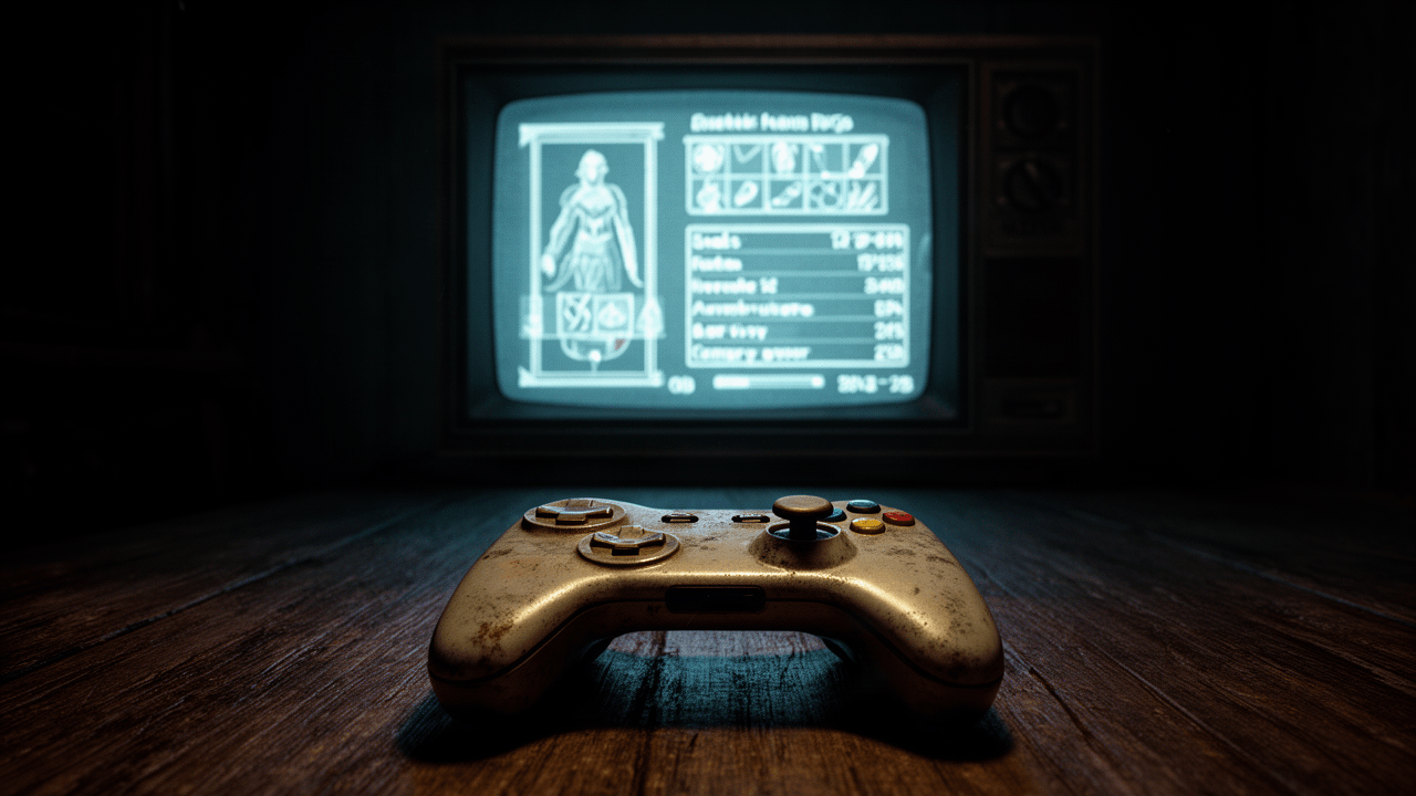
Inventory screens are where retro game UI design shows its teeth. A modern inventory can afford generous spacing, sorting tools, search filters, and multiple tabs. Older games often had a few columns, a cursor, and a prayer.
That simplicity was not always elegant, but it was often brutally clear.
A strong inventory screen did three things well:
1. It made item value obvious
Players needed to know what mattered at a glance. Healing items, key items, equipment, and junk often had to be legible without explanation. Good interfaces used position, color, or icon shape to create hierarchy.
2. It reduced decision fatigue
A cluttered inventory turns every field trip into admin work. Better retro menus kept the list short, grouped related items, or let equipment logic do some of the sorting for the player. Even when the interface was plain, it respected the player’s attention.
3. It made tradeoffs visible
The best inventory screens never hid the cost of choice. If equipping a better sword meant losing speed, defense, or another slot, the menu made that tradeoff hard to miss. That clarity made the game feel fair, even when it was punishing.
The most memorable older inventories tend to be the ones that understand a simple truth: players do not want complexity for its own sake. They want confidence.
Status readouts as a contract with the player
Status screens are where older games either built trust or broke it.
A good status readout answers the questions that matter most:
- How strong am I?
- What is changing?
- What can I survive?
- What is the game expecting next?
In many older games, stats were presented with little narrative cushioning. Numbers stood bare on the screen, and that honesty mattered. When health, magic, defense, or experience were easy to inspect, players could make plans instead of guessing.
That kind of interface also gave personality room to breathe. A status screen did not have to be sterile just because it was functional. Borders, portraits, typography, and icon design could make a menu feel like part of the world. The most elegant examples carry a tone without sacrificing readability.
There is a reason some old status menus still feel good to use. They understand that a readable screen can also be atmospheric. The trick is restraint. Too much ornament and the numbers become hard to scan. Too little and the menu turns into a spreadsheet.
Menu flow is where frustration usually lives
Players often remember a game’s combat, world design, or story more clearly than its menus, but menu flow quietly affects everything. A smooth interface creates momentum. A slow one leaks energy every time you open it.
Retro game UI design had to make a series of small choices that added up:
- How many button presses does it take to equip something?
- Does the cursor remember where you left it?
- Can you compare items without backing out repeatedly?
- Are save, load, and configuration options grouped logically?
- Does the menu confirm actions without nagging the player?
If the answer to these questions was “no,” players felt it immediately. The game might still be great, but the interface would keep stepping on its own toes.
This is why some old menus feel elegant and others feel hostile. Elegance usually comes from reducing friction. Hostility usually comes from making the player repeat themselves.
When personality helps, and when it gets in the way
One of the biggest myths about older interfaces is that they were all plain because they had to be. In reality, retro game UI design often leaned hard into personality. Decorative frames, ornate fonts, character portraits, playful sound effects, and themed windows gave games identity.
That personality could be a strength.
A fantasy RPG menu that looks like an ancient ledger, a sci-fi interface that feels cold and mechanical, or a bright arcade-style HUD can all deepen the mood. The UI becomes part of the fiction.
But style has to be disciplined.
Personality helps when it does at least one of these things:
- reinforces genre or setting
- improves recognition of categories
- gives emotional flavor without obscuring information
- creates visual rhythm so the player knows where to look
It hurts when it becomes decoration first and interface second. If the frame is too elaborate, the text becomes cramped. If the animation is too slow, the menu stops feeling responsive. If the theme is too cute or too severe, the interface starts arguing with the game itself.
The best retro interfaces knew when to stop.
The hidden elegance of screen-space economy
Screen space was never just a technical limitation. It was a design language.
Because older games could not waste room, they developed a strong instinct for compression. That often led to interfaces that say more with less:
- compact stat blocks
- icon-driven item lists
- short command labels
- consistent menu hierarchies
- status text that gets straight to the point
Modern UI can afford to be generous, but generous is not automatically better. A screen can become so spacious that it feels detached from the game’s actual pace. Older interfaces often felt more intimate because they were forced to be direct.
That directness is a big reason some menus still feel elegant now. They do not ask the player to admire them. They ask the player to act.
Why some old interfaces still feel better than modern ones
The strongest retro interfaces usually share a few habits:
They respect repeat use
A menu is not a cutscene. Players will open it over and over. Good retro design assumes fatigue and tries to reduce it.
They use consistent visual grammar
If one symbol means equipment and another means consumable, that logic should stay stable everywhere. Consistency lowers mental load.
They keep important decisions close together
Players should not have to bounce through three submenus to solve one problem.
They make uncertainty visible
If a choice has consequences, the menu should help the player see them. Hidden costs feel worse than hard costs.
They leave a little room for mood
The interface should support the world, not flatten it.
When these pieces line up, the result is an interface that feels calm under pressure. That calmness is why some older games remain pleasant to navigate even now.
What modern designers can still learn from retro game UI design
The point is not to imitate old limitations for nostalgia’s sake. It is to notice what those limitations forced designers to get right.
A modern interface can learn from retro game UI design by:
- prioritizing the most common player action
- reducing nested menu depth
- making status changes obvious immediately
- using theme in service of function
- avoiding decorative clutter that slows decision-making
- treating inventory and loadout management as part of gameplay, not overhead
The lesson is simple but easy to forget: clarity is not the opposite of character. The best old menus had both.
They knew when to show numbers. They knew when to dramatize a choice. They knew that a menu can either break a player’s rhythm or become one more satisfying part of the loop.
That is why the subject still rewards close reading. The interface was never just a frame around the game. For a lot of retro design, it was the first place the game taught you how to think.
If you’ve got a favorite old menu, inventory screen, or status page that still feels perfect, share it in the comments—I’d love to hear which ones still work for you and why.