

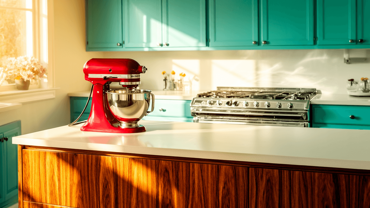
How Kitchen Ads Sold the Dream of Streamlined Domestic Life
The best retro kitchen ads were never really about one appliance. They were about a whole way of living. A stove wasn’t just a stove, and a mixer wasn’t just a mixer. In the ad world, each object became a small machine for making domestic life cleaner, faster, and more polished.
What these ads sold was not only convenience, but confidence. They pictured the kitchen as a place where work could be organized, beautified, and quietly mastered. The promise was simple: if your kitchen looked modern, your day would run more smoothly too.
The kitchen as a stage for modern life
Kitchen advertising understood something important: people were not only buying equipment, they were buying a feeling. A coordinated kitchen suggested order. A streamlined layout suggested intelligence. A bright finish suggested optimism.
In these ads, the kitchen became a kind of domestic showroom. The space was tidy, efficient, and often strangely calm. Pots were handled with ease. Counters stayed clear. Women in the images looked composed rather than exhausted. Every visual cue pointed toward the same message: good design could reduce friction in daily life.
That idea mattered because the kitchen had long been associated with repetitive labor. Advertising tried to recast that labor as manageable, even elegant. Instead of highlighting drudgery, the ads focused on control, speed, and pride.
How retro kitchen ads sold labor-saving promise
The language of efficiency was everywhere in these campaigns. Copywriters leaned on words that suggested less work, less waste, and more time for the rest of life. The appliances were presented as helpers, not just tools.
A few recurring promises show up again and again:
- Faster cooking: stoves and ovens were framed as shortcuts to better meals.
- Less cleanup: smooth surfaces and smart layouts implied easier maintenance.
- Less effort: mixers and blenders promised to handle the tiring parts of food prep.
- More order: cabinet systems and storage solutions suggested a place for everything.
- More pride: a stylish kitchen was pitched as a reflection of taste and good household management.
That last point is important. The ads did not merely say, “This makes life easier.” They also said, “This makes you look capable.” Convenience was tied to identity.
Why appliances looked so glamorous in the ads
One of the most striking features of retro kitchen ads is how beautiful everything looks. The appliance is rarely isolated as a machine. It is staged like a design object.
Chrome trim, glossy enamel, pastel finishes, and carefully arranged accessories turned functional items into visual evidence of progress. The kitchen itself often borrowed cues from showroom display and interior design magazines. Even when the ad was promoting a practical feature, the overall effect was aspirational.
This was no accident. Midcentury advertising relied on the idea that modernity should be visible. If a kitchen was efficient, it should also look efficient. Clean lines and uncluttered spaces became symbols of intelligence and good taste.
That aesthetic was especially powerful because it made modern domestic labor seem almost invisible. The less effort the ad described, the more polished the scene became. Labor was not erased, exactly, but it was made to appear smooth and pleasant.
The role of women in the kitchen ideal
Most kitchen advertising from this era centered women, usually as managers of the home and the day’s routines. The ads often gave them a quiet authority. They were not shown as frantic or overwhelmed. Instead, they appeared poised, smiling, and in control of the room.
That visual strategy did a lot of work. It suggested that the right appliances could transform domestic responsibility into something socially rewarding. The kitchen was still a workplace, but advertising tried to recast it as a site of competence and self-expression.
At the same time, the ads reinforced a narrow idea of who belonged in the kitchen and what kind of labor counted as natural. They blurred the line between empowerment and expectation. The promise of ease was real, but it came packaged inside a very specific domestic ideal.
Stoves, mixers, and blenders as symbols of speed
Different appliances carried different meanings, even when they shared the same promise of modern efficiency.
Stoves
Stoves often represented control over the whole meal. Ads highlighted even heating, reliable temperature, and cleaner design. The message was that good cooking no longer depended on guesswork.
Mixers
Mixers symbolized saved time and reduced physical strain. They stood in for the repetitive beating, whisking, and stirring that once made baking feel like a chore. In ad language, the mixer was practically a household assistant.
Blenders
Blenders signaled speed and modern taste. They implied that drinks, sauces, and purees could be made quickly and stylishly, with less mess and more flair.
Cabinet systems
Cabinet systems were about workflow as much as storage. They promised that a thoughtful layout could remove clutter, reduce steps, and make the kitchen feel like a well-planned machine.
Taken together, these products formed a larger argument: the modern kitchen should behave like a coordinated system.
Design was part of the sales pitch
A key reason these ads still feel visually compelling is that they understood design as persuasion. The appliances were not simply placed in a room; they were framed within a fantasy of domestic order.
Advertising artists used color, perspective, and composition to make the kitchen look more spacious and more serene than real life usually allows. Counters were uncluttered. Lighting was generous. Every object seemed to belong exactly where it was.
That visual discipline reinforced the product claim. If the room looked efficient, the appliance inside it must be efficient too. In that sense, the ad sold not only hardware but harmony.
The modern kitchen was imagined as a place where style and utility met without tension. That was the dream. A beautiful kitchen was not a luxury add-on; it was proof that domestic life had been improved at the root.
The emotional appeal behind the efficiency talk
The most effective kitchen ads knew that time-saving features alone were not enough. They had to connect convenience to emotion.
That meant selling relief, not just speed. Relief from heavy work. Relief from clutter. Relief from the sense that the kitchen was always demanding more than it gave back.
They also sold pride. A well-equipped kitchen implied a household that was current, thoughtful, and socially in step with the times. Modern appliances became status markers, but in a subtle domestic register. They were not loud symbols of wealth; they were quiet signs of good judgment.
And finally, they sold a gentler future. The kitchen of the ad looked like a place where routines would be manageable, meals would come together on time, and the day would feel less relentless. That emotional promise may be the real engine behind the whole category.
Why these ads still matter now
Looking back at retro kitchen ads reveals more than old design trends. It shows how advertising can turn ordinary household objects into symbols of progress, identity, and hope.
The ads mapped a broader cultural belief: that technology could improve everyday life by reducing friction. They also show how visual culture shaped domestic ideals, making efficiency look elegant and labor look effortless.
That tension is what gives these ads their lasting interest. They are charming, yes, but they are also revealing. They show a moment when the modern home was imagined as a machine for better living, and the kitchen was its beating heart.
If you look closely, the message is still familiar today. We still want our homes to be easier to run, better to look at, and more satisfying to inhabit. The language has changed, but the dream remains the same.
If you have a favorite example of a classic kitchen ad, or a memory of the appliances that defined your family’s home, share it in the comments.