

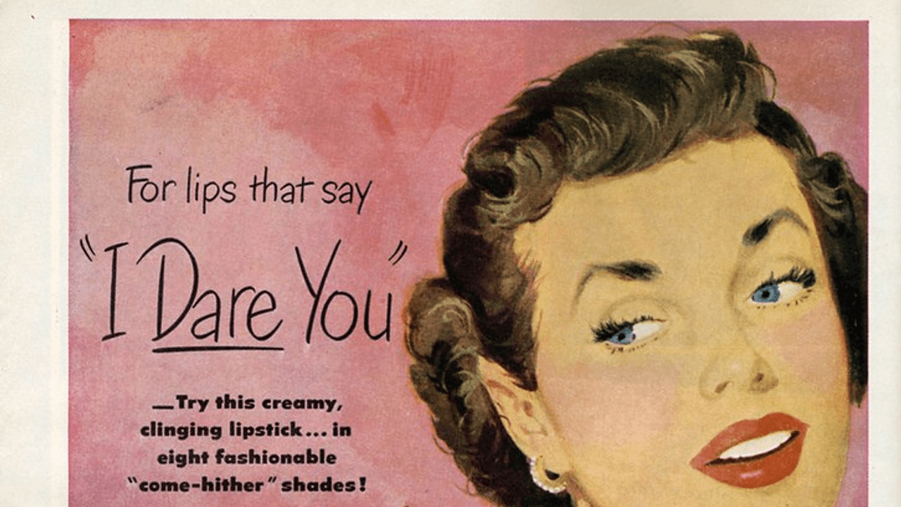
Image credit: Nesster via Openverse / Flickr · CC BY 2.0 · License
How Retro Lipstick Ads Turned Color into Confidence
In retro lipstick ads, a tube of color was rarely just a tube of color. It was a cue, a polish, a social signal, and sometimes a promise that a woman could walk into a room and change the temperature of it. The ads sold lipstick as a small object with outsized power: one careful swipe, and the whole face looked more finished; one bold shade, and the whole personality seemed more assured.
That is what made lipstick advertising so effective. It understood that cosmetics are visual before they are practical. The best campaigns did not explain lipstick in technical terms. They showed it. They put the camera close to the mouth, the hand, the compact, and the mirror. They used color as evidence and romance as atmosphere. They made a private ritual look like public transformation.
Why lipstick was such a perfect advertising object
Lipstick is tiny, portable, and immediately legible. You can see the effect from across a room. That made it ideal for print campaigns that had only a split second to establish a mood. Unlike a dress or a hat, lipstick was also easy to frame as both accessible and dramatic. It did not require a new wardrobe. It required a decision.
That gave advertisers a clean emotional pitch:
- It was affordable glamour. A woman did not need a complete makeover to feel changed.
- It was visible instantly. The color showed up in the ad and in the mirror.
- It suggested intention. Lipstick looked deliberate, not accidental.
- It translated across settings. The same product could imply work, dates, parties, and errands.
The category also worked because lipstick sits right at the line between face and expression. It touches the mouth, which made it ideal for ads built around speech, flirtation, and poise. The product did not just decorate. It framed the act of being seen.
How retro lipstick ads used color as persuasion
Color did a huge amount of heavy lifting in these campaigns. A deep red lip could signal drama. A softer pink could suggest freshness or sweetness. Coral shades often read as energetic and modern. Even when the rest of the ad was relatively restrained, the lipstick itself became the brightest claim on the page.
This was not only about beauty. It was about visual hierarchy. The eye goes straight to the mouth. From there, the ad could imply everything else: confidence, femininity, allure, control. The shade itself acted like a shortcut to personality.
Advertisers knew that the right color could also create contrast. A pale background made the lipstick look richer. A dark dress made the mouth seem brighter. A close crop of the face made the product feel intimate and decisive. In a magazine spread, these choices let a small cosmetic do the work of a whole style system.
The shade was never just a shade
In these ads, color often carried a social message:
- Bright red could imply glamour and evening confidence.
- Pink could suggest youthfulness, softness, or approachability.
- Berry tones could feel sophisticated or mysterious.
- Coral and orange-reds could imply freshness and modern energy.
The point was not subtlety. The point was legibility. A lipstick ad had to make the viewer feel the difference before she ever bought the product.
Close-ups made lipstick feel personal and persuasive
One of the smartest moves in retro lipstick ads was the close-up. The camera zoomed in on the mouth, the fingers twisting the tube, the reflected face in a mirror, or the moment the color touched skin. That tight framing did two things at once. It made the product look precise, and it made the transformation feel achievable.
Close-ups also created intimacy. Instead of presenting a distant model as an untouchable ideal, the ads invited the viewer into the ritual. You were not simply looking at beauty; you were almost participating in it. The hand with the lipstick case, the slightly parted lips, the careful glance downward—these details made the act feel private and repeatable.
There was another advantage to the close-up: it turned finish into proof. Smooth application, a crisp edge, a clean shine, or a matte texture all implied quality. The product did not need a long explanation if the image could show a neat result in one glance.
Romance gave the product emotional stakes
Lipstick advertising leaned hard on romance because romance gave the product stakes. Without it, lipstick could be just another accessory. With it, the ad became a story about attention, attraction, and self-possession.
The romantic pitch did not always have to show a couple. Sometimes it was enough to stage a woman preparing for an evening out, with lighting that suggested anticipation. Sometimes the copy hinted that a lipstick shade would help her be remembered. Sometimes the whole composition said, in effect, this is how you become the version of yourself that walks into the right moment ready.
That is why these ads often felt more narrative than product-driven. They framed lipstick as the last detail before departure, the final touch before the door opens, the small act that changes how a face lands in a crowd. Romance made that detail feel consequential.
Packaging mattered because it turned the tube into a signal
The product itself was part of the message. Advertising frequently highlighted sleek cases, metallic finishes, compact shapes, and elegant caps because packaging helped sell the idea of polish. A lipstick case was something a woman could place on a vanity, slip into a handbag, or reveal in public with a quick, practiced motion. That physical performance mattered.
Good packaging suggested:
- sophistication without fuss
- modernity without coldness
- luxury in a compact form
- a beauty routine that looked composed and intentional
The lipstick tube became a prop in the larger performance of femininity. It was not only about the color on the lips. It was also about the object in the hand. Ads knew that if the case looked chic, the wearer would seem chic too.
Beauty language made transformation sound natural
The copy in these campaigns often used words that softened the sales pitch while sharpening the fantasy. Instead of talking about makeup as concealment, the ads talked about radiance, freshness, grace, allure, and finish. These words made lipstick feel like an enhancement of an existing self rather than a mask.
That distinction is important. A hard sell would have made the product seem artificial. Beauty language made it feel inevitable. It suggested that lipstick did not invent confidence; it revealed it. It did not force attention; it organized it.
This is where the smartest retro lipstick ads became less about makeup and more about social choreography. The woman in the ad was not only prettier. She was more prepared. More current. More in command of how she appeared to others.
What these ads say about style and public life
Lipstick advertising reveals how closely style, confidence, and public presence were linked in the mid-century imagination. A bare face could imply simplicity, but a painted mouth implied readiness. It suggested a woman knew where she was going and how she wanted to be read.
That message mattered because lipstick was one of the most public beauty choices a woman could make. It is hard to wear it invisibly. The ad campaigns leaned into that visibility instead of apologizing for it. They treated conspicuous style as a virtue.
In that sense, the ads did more than sell cosmetics. They sold a theory of self-presentation. A small detail could shift the whole impression. A single color could become a confidence signal. The mouth, framed by the right shade, became a focal point of personality.
Why the formula still works
Modern beauty marketing still borrows from this logic because the formula remains strong. Close-ups still sell precision. Color still signals mood. Romance still adds emotional weight. Packaging still matters. And the promise that one small choice can reshape the day is still one of the most durable ideas in consumer culture.
That is the enduring appeal of retro lipstick ads: they understood that people do not just buy cosmetics to change how they look. They buy them to change how they enter a room.
The best campaigns made that idea feel simple, stylish, and just a little magical.
If you have a favorite lipstick ad, shade, or beauty campaign from the past, share it in the comments—I’d love to hear which ones stuck with you and why.