

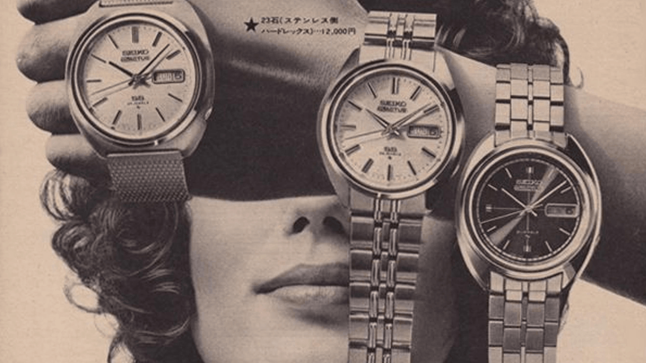
Image credit: Draft web reference from timeandtidewatches.com
The wristwatch wasn’t just a tool. It was a signal.
In retro watch ads, the watch rarely stayed a simple object for long. Yes, it told time. But the more interesting promise was social: wear this and you look disciplined, dependable, and aware of what matters. The watch sat on the wrist like a tiny public résumé.
That’s why so many vintage campaigns treated timekeeping as a personal trait instead of a practical habit. A man who arrived on time was not merely punctual. He was efficient. Respectable. Probably successful. A woman wearing an elegant watch was not just keeping track of the hour; she was moving through the world with polish and self-possession. The product became a shorthand for character.
What makes these ads so revealing is how little they argued. They didn’t need to explain why someone should care about the time. They assumed modern life had already made time precious. Their job was to turn the wristwatch into the right response to that pressure.
How retro watch ads made punctuality look like personality
The core trick of retro watch ads was simple: they connected a functional habit to an identity claim.
Punctuality was framed as more than good manners. It was a mark of control. If you could keep time, you could keep yourself together. If you respected schedules, you respected other people. If you wore a good watch, you didn’t drift through the day—you managed it.
That message worked because the wristwatch is intimate but visible. It lives close to the body, unlike the wall clock or the office clock. So when ads spotlighted the watch, they were also spotlighting the wearer. The object was tiny, but the implication was large: this person notices details.
Vintage campaigns leaned hard on that implication. In an age when business attire, commuter routines, and social etiquette all depended on timing, a watch became a visible sign that you belonged to the modern order.
The ad logic behind the message
A lot of these ads followed a familiar structure:
- show a sharp, polished close-up of the watch
- place it on a confident wrist or in a gift box
- pair it with a business setting, evening wear, or a special occasion
- suggest that ownership means readiness, taste, or achievement
The appeal wasn’t only “don’t be late.” It was “be the kind of person who would never need reminding.”
Close-up product photography made the watch feel deserving of attention
One of the most striking features of retro watch ads is their visual discipline. The product was often photographed close enough to admire the dial, case, hands, and bracelet as if each detail carried moral weight.
That close-up treatment did two jobs at once. First, it made the watch feel precious. You weren’t looking at a commodity; you were looking at an object worthy of inspection. Second, it shifted the ad from utility into style. The photograph invited the viewer to read the watch the way they might read jewelry, tailoring, or a car grille.
The watch face often appeared in a clean, controlled composition. Reflections were managed. Shadows were soft. The background stayed quiet so the object could imply order. Even when the watch was shown in action—on a wrist reaching for a briefcase, a steering wheel, or a champagne glass—it looked composed rather than busy.
That was no accident. The image itself performed the same values the product promised: precision, restraint, and control.
Why the close-up mattered
The close-up made the watch feel like:
- a technical object, because details mattered
- a luxury object, because attention was lavished on it
- a character object, because the wearer’s taste was being judged through it
In other words, the ad said the watch had depth. And if the watch had depth, the wearer probably did too.
Gift framing turned a practical object into a social message
Another recurring move in retro watch ads was the gift angle. Watches were frequently presented as presents for graduations, promotions, weddings, anniversaries, retirements, and holidays.
That framing did something clever: it separated purchase from use. The watch was not only something you bought for yourself because you needed to know the hour. It was something someone gave you because you had reached a milestone. That made the object feel earned.
Gift framing also gave ads permission to speak about emotion without becoming sentimental. A watch could stand in for gratitude, admiration, trust, or ambition. The giver was saying, in effect, “I see your future.” The recipient was being recognized as someone with a path, a role, a reputation.
This is one reason watches appeared so often in ads aimed at men in professional life. A watch could be gifted by a spouse, parent, employer, or mentor. It could mark adulthood, responsibility, or transition into authority. The present was small; the social meaning was not.
Retro watch ads linked self-control to modern taste
A surprising amount of the language around watches overlaps with the language of discipline. Clean lines. Precise mechanisms. Reliable movement. Controlled design. Those values gave the watch an aura of modern taste that went beyond fashion.
In many vintage campaigns, style was not presented as decoration. It was presented as restraint. A tasteful watch did not need to shout. It looked right because it was measured. That’s part of why these ads feel so persuasive even now: they treat elegance as proof of judgment.
The watch, then, becomes a moral object in a soft sense. Not moral in the sense of virtue signaling, but in the sense that it reveals how someone handles order, deadlines, and expectation. The wearer is not just fashionable. They are composed.
That idea fit neatly into the visual world of mid-century advertising, where polished surfaces and careful composition often stood in for aspiration itself. A watch on a wrist was one more way to show that the modern life was not chaotic. It was managed.
The professional credibility pitch was always close to the surface
A large share of retro watch ads borrowed authority from the workplace. Offices, trains, airports, desks, briefcases, and suits all helped translate timekeeping into professional credibility.
The message was subtle but persistent: a person who values punctuality can be trusted with responsibility. They’re the one who shows up, answers calls, catches trains, meets clients, and keeps the day moving.
That is why watches were so often paired with business clothing and executive environments. The accessory wasn’t merely decorative. It completed the look of a person who had somewhere to be and a reason to be there.
This is also where watch ads overlap with broader retro advertising patterns. Other products sold modern identity by attaching themselves to status. Appliances sold convenience as prestige. Cigarettes borrowed authority from doctors. Razors tied grooming to masculinity. Watch ads did something similar by turning punctuality into a personality trait that could be purchased, worn, and displayed.
What the ads implied about the wearer
The ideal watch owner was described without saying much at all:
- efficient rather than careless
- polished rather than fussy
- dependable rather than vague
- modern rather than old-fashioned
- successful without seeming showy
That combination made the watch into a perfect mid-century accessory. It was useful, visible, and socially legible.
Why these ads feel so effective even now
The reason retro watch ads still land is that they understand a lasting social truth: people rarely buy objects only for function. They buy the version of themselves that the object suggests.
A watch promises order in a world that often feels scattered. It promises readiness in a world of missed calls and delayed departures. It promises taste without excess. And because it sits on the wrist, it moves through the day with the person who wears it, quietly reinforcing the same story.
That story is especially strong in older advertising because the ads were more willing to make character claims directly. They didn’t hide behind lifestyle language. They said, plainly, that the right watch could make you seem more capable, more cultivated, and more in control.
There’s a reason those images linger: they understood that a wristwatch is visible in the exact moment someone checks it. The gesture itself becomes a performance. You glance down, and everyone nearby sees not just the time, but your relationship to it.
The larger lesson hidden in vintage watch advertising
The best retro watch ads were never really about clocks in miniature. They were about the fantasy that character can be made visible through objects.
A watch could suggest:
- self-discipline without strain
- elegance without fuss
- ambition without arrogance
- professionalism without explanation
- taste that appears natural, not forced
That’s a powerful bundle of meaning for one small accessory. And it explains why the wristwatch became such a reliable advertising symbol. It could hold the full drama of modern life in a tiny, polished frame.
So when you look at old watch campaigns, don’t just see a product announcement. See an identity pitch. See an era trying to define the ideal person as someone who is on time, composed, and just a little ahead of the moment.
If you have a favorite vintage watch ad—or a memory of the kind of watch that meant something in your family—share it in the comments. I’d love to hear what stood out to you.